
I was scrolling through some packaging supplier’s site a while back, just browsing really, nothing specific in mind, and stopped dead at this black pillow box sitting next to a bunch of white and kraft ones. Didn’t even need a product photo next to it honestly. Just the box alone looked like it was worth more than whatever was probably inside. That’s kinda when it clicked why so many brands went all black with packaging lately.
If you’re thinking about black pillow boxes for your own stuff, or just wondering why they’re suddenly everywhere, here’s what you actually need to know.
Why Black Just Hits Different Somehow
Color does way more psychological work in packaging than people realize honestly. White feels clean, kind of clinical. Kraft feels natural, handmade-ish. Black just feels expensive, almost automatically, before you’ve even read a word on the thing.
No huge scientific reason for this really, it’s more cultural at this point. Luxury brands used black for decades and now our brains just go “this cost more” even when it didn’t.
It’s Also Just Rare Enough To Stand Out
Walk down any aisle, scroll any store online, you’ll see a hundred white or brown boxes for every one black one. That rarity alone gets it attention it wouldn’t get otherwise, just by being the odd one out on the shelf.
Why Pillow Boxes Specifically Work So Well in Black
Pillow boxes already got that soft curved shape going for them, kinda unique next to regular square boxes. Add black on top and now it looks intentional, almost sculptural, not just some container the product got shoved into.
The Shape Plus Color Thing Just Works
A black square box can look kinda harsh honestly, sharp corners plus dark color together. The curve on a pillow box softens all that, so you get premium and approachable at once, which isn’t easy to pull off usually.
Where Black Pillow Boxes Actually Make Sense..
Not every product needs shoving into a black box just cause it looks cool. There’s a few spots where it genuinely fits though.
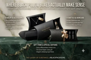
Jewelry and Accessories
Black makes gold, silver, gemstones pop way more than white or colored backgrounds would. Not new either, jewelers used black display cases forever, just carrying over into packaging now.
Cosmetics and Skincare
A lot of premium skincare and makeup brands go heavy on black cause it signals “expensive line” almost instantly, even before someone checks the price.
Gift Items and Special Editions
Doing a limited run or a gift version of a regular product? Black’s an easy way to make it feel different without redesigning the whole thing from scratch.
Does Black Cost More To Actually Produce
Yeah, a bit usually. Deep rich black, not the washed out grey kind, needs more ink coverage or sometimes an extra print pass to look right. Adds a small cost per unit versus lighter colors.
Worth It Most The Time Though
For premium or higher margin stuff, that extra cost’s tiny compared to how much value it adds perception-wise. Nobody’s complaining about slightly higher production cost when customers happily pay more cause the packaging looks this good.
A Couple Things That Can Go Wrong
Not all upside, gotta be honest. Few things worth knowing before ordering a big batch.
Fingerprints Show Up More
Matte black hides this decently, but glossy black shows fingerprints and light scuffs way more than lighter colors do. If your product gets handled a lot before reaching the customer, matte’s the safer call.
Light Text Can Get Tricky To Print
White or light text on black looks amazing done right, but needs decent contrast and clean printing, otherwise thin fonts or small details end up muddy or hard to read.
Matte vs Glossy Black, Which One
Matters more than you’d think when picking these.
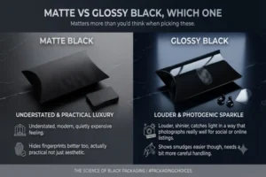
Matte Black
Understated, modern, quietly expensive feeling. Hides fingerprints better too, actually practical not just aesthetic.
Glossy Black
Louder, shinier, catches light in a way that photographs really well for social or online listings. Shows smudges easier though, needs a bit more careful handling.
How To Actually Use These Well
Just going black isn’t automatically enough by itself, needs some thought behind it.
Keep The Design Minimal
Black’s already doing a ton of visual work alone. Busy patterns or too many colors on top usually just fights the whole point of going black. One logo, maybe a small gold or silver foil accent, works better than a packed design most times.
Foil Accents Pair Really Well Here
Gold or silver foil logos on black pillow boxes look genuinely striking, kind of become the go-to combo for that reason honestly. Photographs well too, which matters if customers are gonna share unboxing stuff online.
Final Thoughts
Black pillow boxes aren’t some trend fading out next year, there’s real reasoning behind why it works, the color psychology thing, the rarity, how well it pairs with that soft pillow shape. If your product’s jewelry, cosmetics, or anything gift-worthy or premium, this is honestly worth testing on a small batch before committing fully.



