
The initial impression sells product. Before they have had a chance to smell the product or have read any comments about the product they have already made a decision of whether to pick it up or put it down based on how the box looks. The initial visual judgement of the box is made in a split second of time.
Here are some of the best methods to put together the bath bomb box packaging that is attractive to potential customers and will help to increase the amount of product sold.
Choose an Appropriate Packaging Format
The format of your packaging is important in its design.
Tuck-End Box
It’s the most cost effective & popular format for storing bath bombs in an individual size. It allows you to brand each side of the box simply and clearly. It is also suited to store bath bombs at any price point.
Sleeve and Tray Box
Delivers an upscale two stage unboxing experience with a tray and sleeve format for bath bombs. The sleeve slides off to unveil the bath bomb which is presented on a tray making it an ideal gift with a higher price point.
Windowed Box
A die cut panel allows for seeing the actual bath bomb. This style of packaging helps to build product identity with the packaging design through the use of the product’s color and texture.
Select the appropriate structure for your pricing model and customer type and develop your design around their choice.
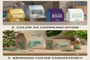
Color is not just for decoration; it is used to communicate a certain quality. Below are examples of how certain colors relate to a specific quality.
Relaxation and Wellness – calming colors (soft lavender, blush pink, white) represent relaxation, self-care, gentleness.
Luxury and Premium – very dark (deep navy, charcoal) and metallic (gold) colors represent sophistication and high value.
Natural and Organic – very light (sage green, warm beige) and organic (earthy) colors represent clean, plant-derived ingredients.
Fun and Gift – brighter (coral, turquoise, yellow) colors represent energy, playfulness and are ready to be given as a gift.
Keep your product line consistent (i.e., use two or three main colors). This consistency will build immediate brand awareness across your entire product line.
Color is not just for decoration; it is used to communicate a certain quality. Below are examples of how certain colors relate to a specific quality
Relaxation and Wellness – calming colors (soft lavender, blush pink, white) represent relaxation, self-care, gentleness.
Luxury and Premium – very dark (deep navy, charcoal) and metallic (gold) colors represent sophistication and high value.
Natural and Organic – very light (sage green, warm beige) and organic (earthy) colors represent clean, plant-derived ingredients.
Fun and Gift – brighter (coral, turquoise, yellow) colors represent energy, playfulness and are ready to be given as a gift.
Keep your product line consistent (i.e., use two or three main colors). This consistency will build immediate brand awareness across your entire product line.
Highly Innovative Finishing Products Will Add Value to Your Product
When customers see your product with a premium finish, it will enhance their perception of the item before they even open it.
Matte Laminating: This finish has a soft, velvety texture and provides an appearance of deeper, richer colors which make it the standard for many of today’s luxury bath brands.
Spot UV Coating: Glossy coatings applied only to the logo or some other key design element create a very eye-catching appearance with a contrast (due to its glossy nature) to the matte background of the box.
Foil Stamping: When foil (gold, silver or rose gold) is used for the brand name or border, it will give the impression that the brand is of premium quality.
Embossing or Debossing: When you raise a design element above the surface or push it down into the box, you now have a 3-dimensional design element that is very memorable to customers.
Adding any one of the finishes will elevate the look of a simple box to one that appears to have a higher perceived value than a regular box.
Select Fonts Wisely
Fonts must be chosen wisely because they carry specific meaning. For example, if there is a decorative script or serif for the brand name, then the product detail can be done in a clean sans serif. This will help provide an elegance to the product while maintaining readability for the consumer.
Establish Fonts by Hierarchy
Use a hierarchy throughout the packaging by establishing the order of fonts specified below. Follow this order:
Brand Name – Largest and Boldest
Product Name or Scent – Second in Size
Ingredients and Weight – Smallest in size, but still legible
Limit Fonts to Three Per Box
Limit the number of font selections per each bath bomb box to no more than three. Two many different types of fonts make it difficult to follow and conveys that the brand lacks design discipline, thereby reducing the brand’s credibility.
Include Botanical Illustrations on Packaging
Bath bombs come from nature. Show this through visual communication.
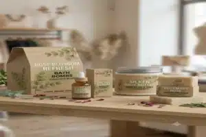
Use custom illustrated botanicals (e.g. rose watercolor, eucalyptus branches, lavender fields) to communicate this message visually.
Why Use Illustrations Instead of Stock Images
There are many stock images used by several other companies; therefore, when you create a custom illustrated image, no other company has the same image as you. Therefore, the custom illustrated image serves as your unique signature which will make it hard for others to duplicate unless they actually copy directly.
Using the same botanical motifs across all products will develop a strong visual brand identity over time.
Consider Designing The Inside Of A Box Too.
Many companies entirely disregard such an opportunity by focusing solely on what’s on the outside of their packaging. The inside is arguably just as much, if not more, of an opportunity for creating a memorable unboxing experience as the outside and all that goes along with it
Here are some simples things to put inside your box:
- A pattern printed on the inside of your package in your brand’s colors.
- A hand-written style thank you note or card.
- A scent strip attached to the inside of the lid.
- A small card with directions or QR code where/how to use the product.
These elements represent minor details that help create an unforgettable unboxing experience which customers take pictures of and share with their friends via Instagram, TikTok, and YouTube etc., thus providing your brand with free, organic exposure/marketing.
Now go green (and advertise it!).
Over 60% of cosmetic/beauty consumers consider a green/sustainably produced package an important aspect prior to making their purchase decision.
Green Packaging Options That Still Look High-End:
- Recycled Kraft board — has a very earthy/hand-crafted look to it.
- Biodegradable lamination films — will make your package environmentally sound but will not compromise the final appearance/quality of your finished
- Vegetable or soy inks for printing — cleaner to print with & provide brighter colors
- FSC certified paperboard (or approved product) — a globally recognized certification as being green.
Include a green proof on your packaging; a simple “100% recyclable” stamp on the outside of the package, or an FSC certification logo/badge, are great ways of showing you care about Our Planet! This will give environmentally-friendly customers one more reason to select your brand over another.
Conclusion
Your bath bomb box is not just a box to hold your products, it is the first item that a prospective customer will touch, it is the last item that a customer will take a picture of; and at the same time, it is the most advertised representation of your brand throughout the world.
Develop your packaging with as much detail as you applied to the formulation of your product, and you will be able to sell your bath bombs every day.



