
How to Design Christmas Gift Packaging That Actually Gets Opened First

Walk into any store during the holiday season and you’ll notice something: the products people pick up first aren’t always the best ones — they’re the best-packaged ones. Christmas is the one time of year when packaging isn’t just protection, it’s part of the gift. If you’re selling anything from candles to cookies to jewelry, the box your product ships in is doing marketing work whether you’ve designed it intentionally or not.

Here’s a practical, no-fluff walkthrough of what actually goes into designing Christmas gift packaging that stands out on a shelf, in a photo, and under a tree.

1. Start With the Unboxing Moment, Not the Box

Walk into any store during the holiday season and you'll notice something: the products people pick up first aren't always the best ones — they're the best-packaged ones. Christmas is the one time of year when packaging isn't just protection, it's part of the gift. If you're selling anything from candles to cookies to jewelry, the box your product ships in is doing marketing work whether you've designed it intentionally or not.
Here's a practical, no-fluff walkthrough of what actually goes into designing Christmas gift packaging that stands out on a shelf, in a photo, and under a tree.
1. Start With the Unboxing Moment, Not the Box
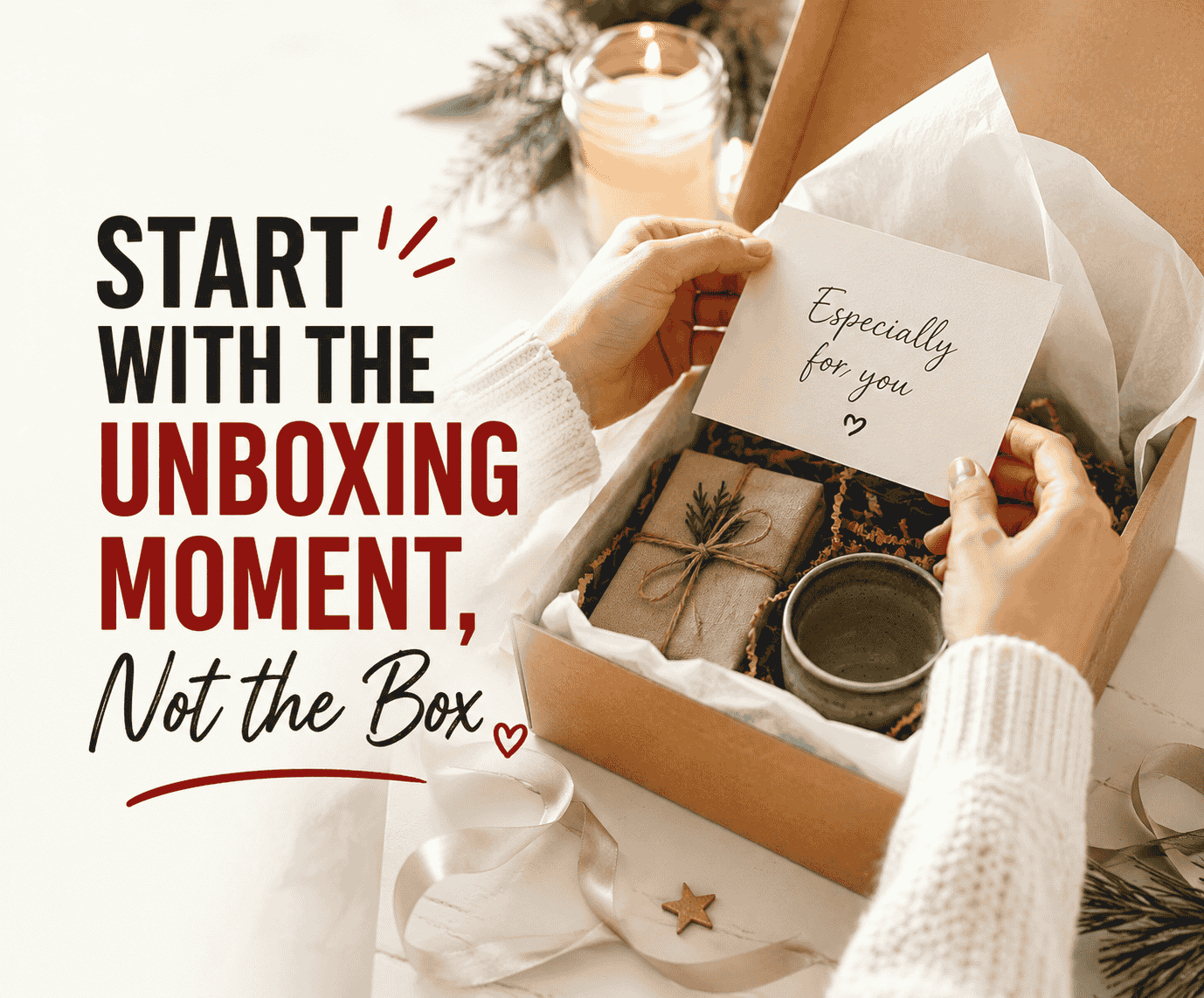
Most people design a box outside-in: pick a color, add a logo, done. Flip that. Start by imagining the person opening it — what do they see first, what do they touch first, what makes them want to post it on Instagram? Working backward from that moment usually produces better design decisions than starting from a blank template.
Ask yourself:
Is the "reveal" the lid coming off, tissue paper parting, or a ribbon being pulled?
Does the inside of the box matter as much as the outside? (For gifting, it often does.)
Will this be photographed before it's opened?
2. Pick a Color Story, Not Just "Christmas Colors"
Red and green will always read as festive, but they're also the default — which means they're the easiest to ignore. A color story gives your packaging a personality instead of a season.
A few directions worth considering:
Deep, muted tones (forest green, burgundy, charcoal) with a single metallic accent — reads premium and works well for gifting.
Monochrome with texture — an all-white or all-kraft box that leans on embossing, spot varnish, or a debossed logo instead of color for visual interest.
Warm minimalism — cream and gold with one small illustrative detail (a sprig, a star, a hand-drawn line) rather than an all-over pattern.
Whichever direction you pick, consistency matters more than the specific colors. A box that matches your brand's usual palette but adds one seasonal accent will feel more intentional than a box that goes fully generic-Christmas and abandons your brand identity for six weeks.
3. Choose a Structure That Matches How the Gift Will Be Used
Box style isn't just aesthetic — it changes the experience:
Lid-and-base boxes feel formal and gift-like; good for jewelry, accessories, or anything you want to feel "presented" rather than just delivered.
Window boxes build anticipation without a full reveal — useful for food items or products where the visual itself sells.
Sleeve-and-tray boxes add a satisfying second layer to the unboxing and are a good middle ground between cost and ceremony.
Mailer boxes with festive interior printing are worth it if a meaningful share of your orders ship directly to the recipient rather than being wrapped by the buyer — the "inside" becomes the only wrapping paper they get.
If your product is being bought as a gift for someone else (rather than self-purchased), lean toward the more ceremonial structures. If it's a stocking-stuffer or add-on item, simpler and cheaper is usually the smarter call — over-designing a $12 item can actually undercut trust.
4. Let Materials Do Some of the Design Work
Texture reads as quality before color or print does. A few materials worth considering beyond standard printed cardstock:
Kraft paper for a natural, less-mass-produced feel — pairs well with a single foil or ink color.
Soft-touch or matte lamination to make even a simple design feel premium under the hand.
Embossing/debossing for logos or patterns — especially effective on monochrome boxes where color isn't doing the work.
Recycled or FSC-certified stock, which is increasingly something customers actively look for, not just a nice-to-have.
If budget only allows for one upgrade, spend it on tactile finish rather than a more complex print — people register texture faster than they register detail.
5. Typography and Logo Placement Still Matter
Holiday packaging tends to get all the design attention poured into illustration and color, and the logo gets shrunk into a corner as an afterthought. Don't do that. Your logo and any seasonal messaging should follow the same hierarchy your everyday packaging does — customers should recognize the brand at a glance, holiday version or not. A simple rule: if someone saw the box with the illustration removed, could they still tell whose product it is?
6. Design for the Photo, Not Just the Shelf
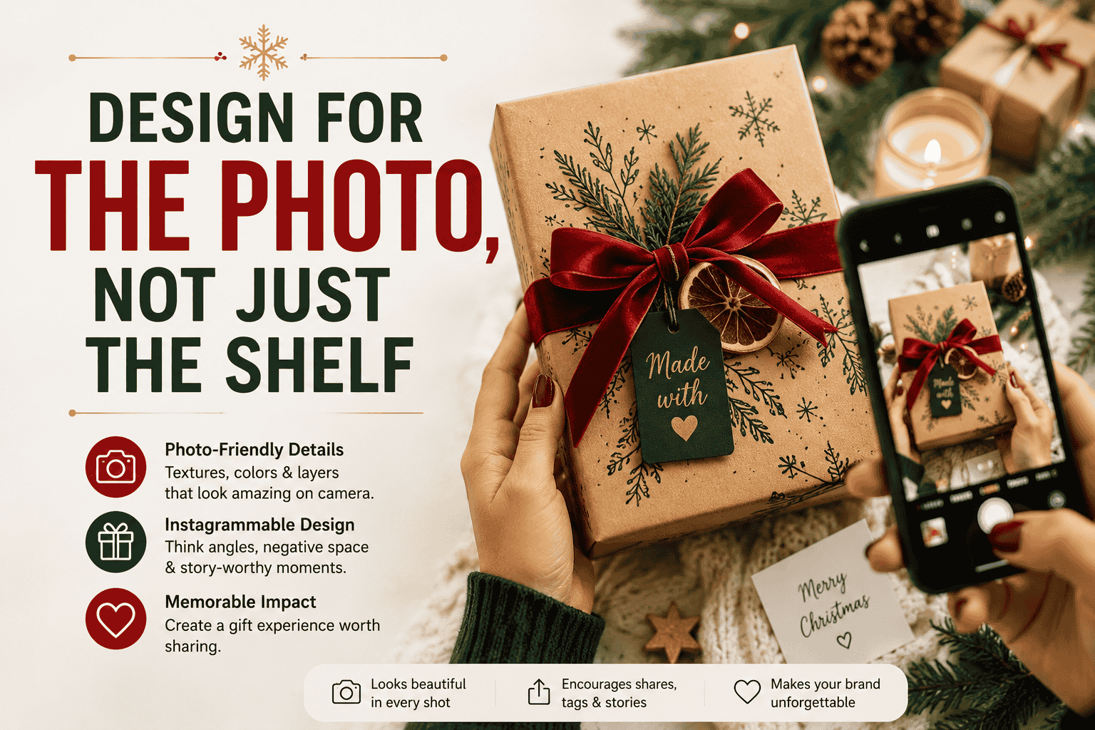
A large share of gift packaging is now experienced first as a photo — unboxing videos, gifting posts, influencer mailers. That changes a few practical decisions:
Interiors matter as much as exteriors (tissue paper color, printed inserts, a small thank-you card).
Avoid glossy finishes that create harsh camera glare under indoor lighting.
Leave "negative space" in the design — an overly busy box photographs worse than one with breathing room.
7. Don't Forget the Practical Constraints
Design ambition has to survive contact with logistics:
Lead times spike in Q4. Whatever your supplier's normal turnaround is, holiday printing queues are longer — lock in your design and place orders well before your usual timeline.
Minimum order quantities can make elaborate custom finishes (foil, spot UV, custom die-cuts) expensive at low volume. Simpler techniques scaled well often beat one elaborate technique done at minimum viable quantity.
Shipping durability matters more for gift packaging than everyday packaging, since a damaged box undercuts the entire "special occasion" feeling you designed for.
8. A Simple Checklist Before You Finalize
Before sending a design to print, it's worth running through:
Does the box still look like your brand, or could it be anyone's generic holiday packaging?
Is there one clear focal point, or is the design competing with itself?
Does the structure match how customers will actually use/give the product?
Have you accounted for how it looks both in person and in a photo?
Does the interior get any design attention, or does it stop at the lid?
Final Thought
The brands that win at holiday packaging usually aren't the ones with the biggest budget — they're the ones who picked one or two ideas (a color story, a texture, an unboxing detail) and executed them well, instead of trying to do everything. Christmas packaging has a short shelf life, but a good one does more brand-building in six weeks than plenty of campaigns do all year.


Most people design a box outside-in: pick a color, add a logo, done. Flip that. Start by imagining the person opening it — what do they see first, what do they touch first, what makes them want to post it on Instagram? Working backward from that moment usually produces better design decisions than starting from a blank template.

Ask yourself:

  • Is the “reveal” the lid coming off, tissue paper parting, or a ribbon being pulled?
  • Does the inside of the box matter as much as the outside? (For gifting, it often does.)
  • Will this be photographed before it’s opened?

2. Pick a Color Story, Not Just “Christmas Colors”

Red and green will always read as festive, but they’re also the default — which means they’re the easiest to ignore. A color story gives your packaging a personality instead of a season.

A few directions worth considering:

  • Deep, muted tones (forest green, burgundy, charcoal) with a single metallic accent — reads premium and works well for gifting.
  • Monochrome with texture — an all-white or all-kraft box that leans on embossing, spot varnish, or a debossed logo instead of color for visual interest.
  • Warm minimalism — cream and gold with one small illustrative detail (a sprig, a star, a hand-drawn line) rather than an all-over pattern.

Whichever direction you pick, consistency matters more than the specific colors. A box that matches your brand’s usual palette but adds one seasonal accent will feel more intentional than a box that goes fully generic-Christmas and abandons your brand identity for six weeks.

3. Choose a Structure That Matches How the Gift Will Be Used

Box style isn’t just aesthetic — it changes the experience:

  • Lid-and-base boxes feel formal and gift-like; good for jewelry, accessories, or anything you want to feel “presented” rather than just delivered.
  • Window boxes build anticipation without a full reveal — useful for food items or products where the visual itself sells.
  • Sleeve-and-tray boxes add a satisfying second layer to the unboxing and are a good middle ground between cost and ceremony.
  • Mailer boxes with festive interior printing are worth it if a meaningful share of your orders ship directly to the recipient rather than being wrapped by the buyer — the “inside” becomes the only wrapping paper they get.

If your product is being bought as a gift for someone else (rather than self-purchased), lean toward the more ceremonial structures. If it’s a stocking-stuffer or add-on item, simpler and cheaper is usually the smarter call — over-designing a $12 item can actually undercut trust.

4. Let Materials Do Some of the Design Work

Texture reads as quality before color or print does. A few materials worth considering beyond standard printed cardstock:

  • Kraft paper for a natural, less-mass-produced feel — pairs well with a single foil or ink color.
  • Soft-touch or matte lamination to make even a simple design feel premium under the hand.
  • Embossing/debossing for logos or patterns — especially effective on monochrome boxes where color isn’t doing the work.
  • Recycled or FSC-certified stock, which is increasingly something customers actively look for, not just a nice-to-have.

If budget only allows for one upgrade, spend it on tactile finish rather than a more complex print — people register texture faster than they register detail.

5. Typography and Logo Placement Still Matter

Holiday packaging tends to get all the design attention poured into illustration and color, and the logo gets shrunk into a corner as an afterthought. Don’t do that. Your logo and any seasonal messaging should follow the same hierarchy your everyday packaging does — customers should recognize the brand at a glance, holiday version or not. A simple rule: if someone saw the box with the illustration removed, could they still tell whose product it is?

6. Design for the Photo, Not Just the Shelf

Design for the Photo, Not Just the Shelf

A large share of gift packaging is now experienced first as a photo — unboxing videos, gifting posts, influencer mailers. That changes a few practical decisions:

  • Interiors matter as much as exteriors (tissue paper color, printed inserts, a small thank-you card).
  • Avoid glossy finishes that create harsh camera glare under indoor lighting.
  • Leave “negative space” in the design — an overly busy box photographs worse than one with breathing room.

7. Don’t Forget the Practical Constraints

Design ambition has to survive contact with logistics:

  • Lead times spike in Q4. Whatever your supplier’s normal turnaround is, holiday printing queues are longer — lock in your design and place orders well before your usual timeline.
  • Minimum order quantities can make elaborate custom finishes (foil, spot UV, custom die-cuts) expensive at low volume. Simpler techniques scaled well often beat one elaborate technique done at minimum viable quantity.
  • Shipping durability matters more for gift packaging than everyday packaging, since a damaged box undercuts the entire “special occasion” feeling you designed for.

8. A Simple Checklist Before You Finalize

Before sending a design to print, it’s worth running through:

  • Does the box still look like your brand, or could it be anyone’s generic holiday packaging?
  • Is there one clear focal point, or is the design competing with itself?
  • Does the structure match how customers will actually use/give the product?
  • Have you accounted for how it looks both in person and in a photo?
  • Does the interior get any design attention, or does it stop at the lid?

Final Thought

The brands that win at holiday packaging usually aren’t the ones with the biggest budget — they’re the ones who picked one or two ideas (a color story, a texture, an unboxing detail) and executed them well, instead of trying to do everything. Christmas packaging has a short shelf life, but a good one does more brand-building in six weeks than plenty of campaigns do all year.

