
A friend of mine worked at a print shop years back, one that handled a lot of tobacco packaging orders. He told me something once that never really left my head. Most brands walk in saying they want to look “premium.” Then you put three or four samples in front of them and half the room can’t agree on which one actually looks premium.
That’s the whole problem with this category if you ask me. Everyone wants a box people spot from across a shelf. Almost nobody shows up with an actual plan for how to get there.
So here’s what genuinely matters if you’re trying to design a cigarette pack that gets noticed, remembered, picked up, without stepping on any of the rules attached to this industry.
Why This Is Harder Than Regular Packaging
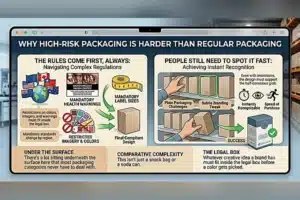
This isn’t a snack bag or a soda can. There’s a lot sitting underneath the surface here that most packaging categories never have to deal with.
The Rules Come First, Always
Health warnings. Mandatory label sizes. Restricted imagery. All of it shifts depending on which country you’re selling in. Whatever creative idea a brand shows up with has to fit inside that legal box before a single color gets picked.
People Still Need to Spot It Fast
Even with all those restrictions eating up space, a pack has to stay instantly recognizable. Most regular buyers grab their brand almost without looking properly at the shelf. The design has to support that half-conscious grab.
Material Before Artwork, Not After
A lot of brands jump straight to logos and color schemes. Wrong order, honestly.
Cardstock Weight Says More Than the Print
A flimsy box feels cheap the second it’s in someone’s hand. Doesn’t matter how good the print looks on a screen. Heavier stock fixes that instantly, and no clever design trick really makes up for it.
Matte or Glossy Changes the Whole Read
Matte usually comes off more refined, more modern. Glossy leans traditional, sometimes a bit louder depending on what color’s underneath it. Neither one’s wrong. It just needs to actually match what the brand’s going for.
Colour Is Doing More Work Than People Think
There’s so little usable space once the warning labels eat into the layout, so color ends up carrying a lot of the message.
Dark reds, blacks, deep blues tend to read as bolder, stronger, in people’s heads without anyone explaining why. Most brands lean into that instead of fighting it. Lighter palettes, silver, white, pale tones, usually signal something milder instead. It’s a strong enough pull that switching just the color on a pack can shift what someone expects it to taste like before they’ve even opened it. Kind of wild when you think about it.
Typography Has Very Little Room to Work With
Between the limited space and the mandatory warnings, whatever’s left for the actual brand has to pull its weight.
The Brand Name Needs to Hold Its Ground
Warning labels take up a lot of real estate these days. A bold, well-placed logotype keeps the pack recognizable sitting right next to all that mandatory text.
Skip the Fancy Fonts
They look nice on a mockup, sure. Fall apart fast in dim lighting behind a counter though, or from a few feet away. Clean, confident type wins almost every time in this category.
The Shape of the Box Matters More Than You’d Guess

Flip-top designs feel modern, and that’s honestly what most people expect now. Slide boxes carry more of an old-school feel, a little nostalgic even, and some brands lean into that on purpose rather than treating it as dated.
Small structural touches count too. A magnetic closure. A slightly reinforced edge. That satisfying click when it shuts properly. None of that shows up in a flat printed mockup, but it’s exactly the stuff that makes a pack feel like quality once it’s actually in someone’s hand.
How It Feels in a Pocket Matters Just as Much
This part gets skipped constantly, but it’s just as important as how the box looks sitting on a shelf.
A pack that’s slightly too bulky, or has sharp edges digging into a pocket all day, gets annoying fast. That kind of small discomfort quietly affects whether someone buys the same brand again, more than most companies seem to realize.
Durability plays into this too. A pack gets opened and closed dozens of times before it’s empty. If it starts falling apart by day two, that reflects badly on the whole brand, even if the printing looked great on day one.
Compliance and Creativity Aren’t Really Enemies
This is the real tension running through the whole category, so it’s worth just saying it plainly.
Fighting the mandatory warning space usually just makes the layout look cluttered and awkward. The smarter move treats the warning as a fixed anchor and builds everything else cleanly around it instead of resisting it.
Even with tight restrictions, there’s still room for a distinct color, a subtle texture, a closure that feels a bit different. Small details like that end up carrying most of a brand’s identity once the bigger creative swings aren’t an option anymore.
Mistakes Worth Avoiding
- Chasing a trendy color that doesn’t match what customers already associate with the product
- Overcrowding the layout once the mandatory warning space has already eaten into it
- Cutting corners on material to save cost, which shows up fast the moment the pack is opened
- Ignoring how the thing feels to carry and reopen all day long
Final Thoughts
Designing a pack people actually notice isn’t about chasing the boldest idea on the table. It’s about working smart inside a genuinely tight set of rules, then putting real thought into material, color, and structure so whatever a brand can still control ends up feeling deliberate instead of like an afterthought.
Get the basics right, decent material, sensible color choices, clean type, a structure that survives daily handling, and the pack just quietly does its job, shelf after shelf, next to a dozen competitors trying to pull off the exact same thing.



