
Your coffee might taste incredible. But if the coffee bag design looks like an afterthought, most customers will walk right past it.
That’s not an opinion — research shows consumers make purchase decisions within 90 seconds of seeing a product for the first time. In retail, that 90 seconds is all your packaging gets. This guide breaks down exactly what separates coffee bags that move product from ones that collect dust on the shelf.
Why Coffee Bag Design Is a Sales Tool, Not Just a Container
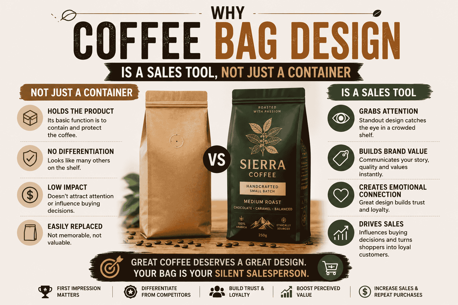
Coffee brands have a real problem: beans look the same. Once roasted, the product is visually homogeneous. Two bags side by side — same size, same dark color — tell the buyer nothing. That gap between what the coffee tastes like and what the buyer can see before purchasing is where design does the heavy lifting.
A well-designed coffee bag communicates origin, flavor profile, brand values, and price point before a single word is read. The colors, textures, typography, and bag format all work together to shape a buyer’s first impression. Get that right, and you’re not just selling coffee — you’re selling a feeling before the customer even opens the bag.
1. Choose the Right Bag Style First
Before colors or logos, the shape of the bag itself sends a signal. Here are the four main formats and when to use each:
Stand-Up Pouches The most popular retail format. They stand upright on shelves without support, maximizing visibility. Wide printable surface area makes them great for branding. Works well for both ground coffee and whole beans.
Flat Bottom Bags (Box Pouches) A step up from the stand-up pouch. They have a wider base, which means they sit more stably and take up a rectangular footprint that stacks cleanly. They look premium on shelves and give even more surface area for design.
Side Gusset Bags Classic coffee packaging format. A gusset runs along the sides, expanding the bag’s capacity. Common in specialty and wholesale coffee. Less real estate for design but still popular among roasters who want a traditional look.
Kraft Paper Bags Work well when the brand story is centered around sustainability or an artisan image. Recyclable and compostable options exist. The natural brown texture communicates approachability and eco-consciousness without needing to say much.
The format choice matters because it affects shelf presence, storage, and perceived price point. Flat bottom bags tend to read as premium. Stand-up pouches are the most versatile. Side gusset is traditional. Kraft reads as handcrafted or sustainable.
2. Pick Materials That Protect and Sell
The packaging material isn’t just a structural choice — it directly affects freshness, shelf life, and customer trust.
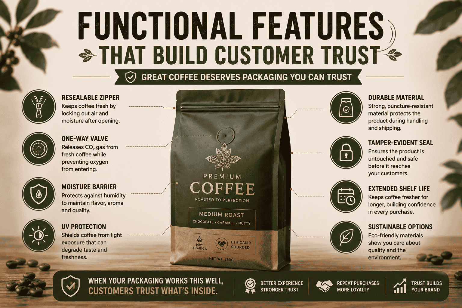
Aluminum Foil / Mylar The strongest barrier against oxygen, moisture, light, and heat. These are the four main enemies of fresh coffee. Aluminum and Mylar bags block all four effectively, giving roasted beans or ground coffee the longest possible shelf life. A one-way degassing valve is often added to release the CO₂ naturally produced by freshly roasted coffee without letting outside air in.
Multi-Layer Laminate Combines layers of different materials (foil, polyester, polyethylene) to balance barrier properties with flexibility. This is the most common material in premium retail coffee packaging. The downside is that traditional multi-layer laminates are difficult to recycle — something brands are actively working to change with mono-material alternatives.
Kraft Paper Lower barrier but high on brand appeal. Works well for shorter shelf-life products or when the coffee is moving fast enough that freshness isn’t a concern. Kraft is increasingly available in food-grade lined versions that offer reasonable moisture resistance while staying recyclable or compostable.
Eco-Friendly / Compostable Films Made from plant-based materials like PLA (polylactic acid) or paper-PLA blends. Demand for these is growing, especially among specialty coffee buyers. If sustainability is part of the brand message, certifying the packaging through a recognized body (like TÜV) adds credibility to the claim.
If the coffee is being sold through retail, prioritize barrier strength. If it’s a short-run, direct-to-consumer product for a market or café, kraft or compostable films can work without sacrificing freshness.
3. Design Elements That Drive Purchase Decisions
Color Psychology
Color is the first thing a buyer notices. A 2023 Coffee Science Foundation study found that packaging color directly affects consumer expectations of taste and perceived value. Yellow bags were associated with higher acidity, pink with sweetness and fruit-forward notes — and buyers said they would pay more for the pink bag even if they didn’t prefer fruity flavors. That’s how strongly color shapes perception.
Some practical direction:
- Dark tones (black, deep navy, dark green) communicate sophistication and premium quality
- Natural browns and earth tones communicate craft, origin-focus, or sustainability
- Bright colors (orange, red, vibrant blues) work well for energetic, accessible, or fun brands
- Minimalist white or cream reads as clean and modern
Pick a color palette that matches the brand’s personality and the product’s price point. A budget coffee in a black matte bag with gold accents will sell for more than the exact same coffee in a plain kraft bag with a basic label. That’s not dishonest — it’s just how retail works.
Typography
Bold, clear typography consistently outperforms complex scripts on retail shelves. The reason is simple: customers scan, they don’t read. The brand name needs to register in a fraction of a second. Keep the primary typeface strong and readable, and limit font use to two — one for display (brand name, product title) and one for body text (tasting notes, origin, weight).
Storytelling Through Design
Coffee has more origin story than almost any other product. Where it was grown, who grew it, how it was processed, what the altitude was — these details matter to specialty coffee buyers and can justify significantly higher prices. Packaging that communicates this — through illustrations, maps, text blocks, or QR codes linking to farm videos — builds an emotional connection that turns one-time buyers into repeat customers.
A QR code on the bag is one of the most underused tools in coffee packaging right now. It can link to brewing guides, the farm’s story, a loyalty program, or a playlist the brand curated for morning coffee sessions. It costs almost nothing to add and gives customers a reason to scan every time they pick up the bag.
Window Cut-Outs
A clear window lets customers see the product directly. For whole-bean coffee, this builds trust — customers can see the roast level, the bean size, the quality. It removes uncertainty. Window pouches consistently perform well at retail because they turn the product itself into part of the design.
4. Finishes That Upgrade Perception
The surface finish on a coffee bag is what customers feel before they look at the label. It’s tactile marketing, and it works.
Matte Lamination Soft, non-reflective surface. Associated with premium, modern brands. Works particularly well with minimalist or dark-color designs. Matte finishes tend to signal quality without shouting.
Gloss Lamination High-shine surface. Creates vibrancy in color designs. Works well for bright, bold, and energetic brands. More affordable than specialty finishes.
Soft Touch / Velvet Lamination Creates a velvety texture that’s genuinely satisfying to hold. Customers notice it immediately. Tends to elevate the perceived value of the product significantly.
Spot UV A clear coating applied to specific areas — a logo, a pattern, or a design element. The contrast between the matte base and the glossy spot creates visual and tactile interest. Popular for premium and specialty lines.
Foil Stamping Metallic foil — gold, silver, copper, holographic — applied to select elements. The gold or metallic finish strongly signals luxury. Even a small foil stamp on the logo can shift how a buyer perceives the price-to-quality ratio.
Embossing / Debossing A raised or recessed design element. Adds texture. Often used on logos or brand marks. Customers run their fingers over embossed packaging naturally — it’s one more moment of engagement before the purchase.
These finishes can be combined. Matte base with spot UV highlights and a foil logo is a common high-performing combination in the specialty coffee market.
5. Functional Features That Build Customer Trust
Design and functionality are not separate decisions. The features on the bag directly affect the customer experience.
One-Way Degassing Valve Freshly roasted coffee releases CO₂ for days after roasting. Without a valve, the gas builds up and can cause the bag to burst. A one-way valve lets CO₂ out while keeping oxygen out. Customers who know coffee see the valve and know the product inside was recently roasted — it’s a trust signal.
Resealable Zipper Once opened, coffee needs to stay protected from air and moisture. A resealable zipper allows customers to close the bag after each use, extending freshness. Bags without resealable closures are a small frustration that customers remember.
Tin Ties A lower-cost alternative to a zipper. Less convenient, but widely used in café and specialty retail. Works well for kraft and artisan-style packaging.
Clear Windows Already mentioned from a design standpoint, but worth noting again for function: windows reduce buyer hesitation. Customers who can see the product before buying feel more confident in the purchase.
6. The Minimalist vs. Maximalist Question
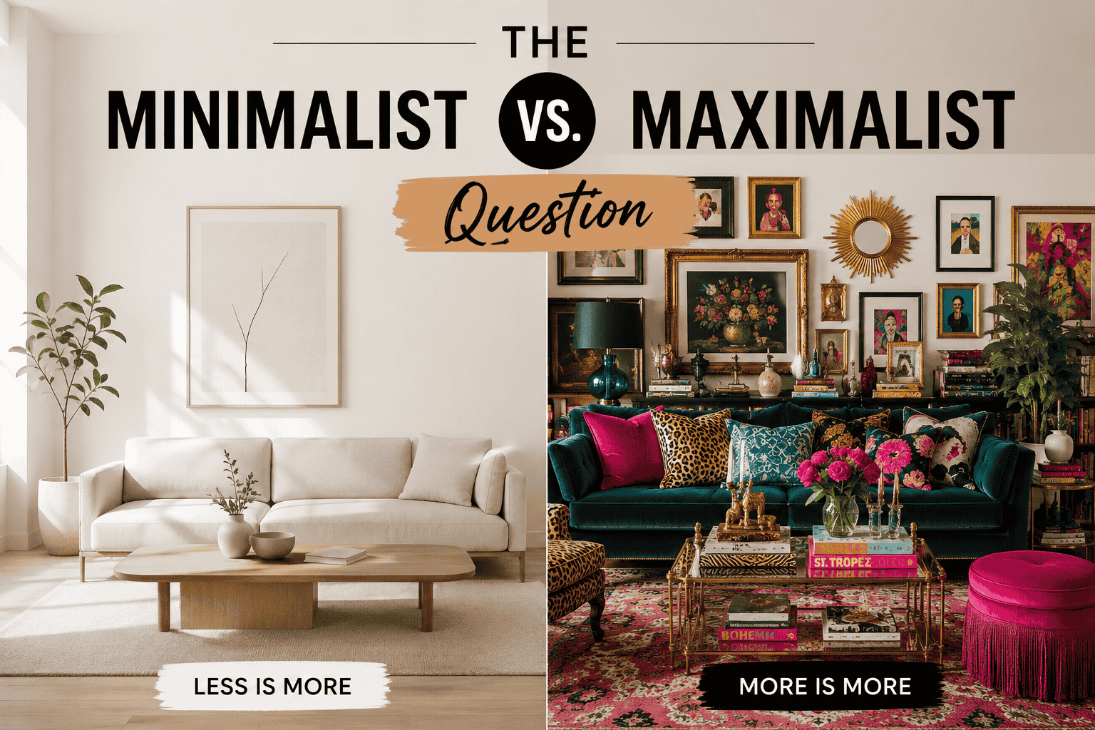
There’s no universal answer here — both approaches work when executed well.
Minimalist design focuses on restraint. A single striking element, clear typography, and a lot of open space. Rascal Coffee in London built its brand on a clean, pared-back look that helped their bags stand out in stockists almost immediately. Minimalism implies confidence: the brand isn’t trying to convince you of anything.
Maximalist design uses bold illustration, complex patterns, bright colors, and dense visual information. Done well, it creates bags that feel like collectibles. Couplet Coffee’s holographic, full-coverage packaging is a strong example — customers share it on social media and the packaging becomes part of the brand identity.
The key with maximalism is that it still needs a clear focal point. Busy design without hierarchy looks chaotic, not creative.
7. Common Mistakes That Hurt Coffee Bag Sales
Inconsistent design across SKUs. If the 250g bag, 500g bag, and 1kg bag look completely different, buyers can’t recognize the brand family. Build a consistent visual system and vary only the elements that communicate something meaningful (roast level, origin, product line).
Too much text. Listing every certification, award, roasting date, brewing tip, and flavor note in tiny font creates visual noise. Prioritize. The key information should be readable at arm’s length.
Poor material choice for the shelf life. Choosing kraft paper for a coffee with a six-month intended shelf life will result in freshness issues that damage brand reputation. Match the material to the actual shelf life needs.
Ignoring tactile experience. A bag that looks good but feels cheap undermines the premium positioning. The weight of the bag, the finish, the thickness of the material — all of it adds up to a physical impression that affects buying decisions.
Skipping the degassing valve. This is a basic freshness feature. Bags without it signal that freshness wasn’t considered in the packaging design.
How to Order Custom Coffee Bags That Perform
Getting the design right is step one. Getting it manufactured and printed correctly is step two.
When working with a packaging supplier, confirm:
- Minimum order quantities — lower MOQs let smaller roasters test designs without overcommitting
- Printing method — digital printing for short runs and prototypes; flexographic or gravure printing for large runs with consistent color
- Color matching — specify Pantone colors if brand consistency across batches matters
- Sample approval process — always review a physical sample before committing to a full run
- Turnaround time — especially important for seasonal or limited-edition designs



