
A friend of mine hosted a dinner a while back, and one of the wine bottles on the table had this small tag hanging off the neck. Just a recipe pairing, printed on plain card. Nothing about it screamed marketing. But three people picked that bottle up just to read the tag, and two of them actually asked where to buy it later that night.
That tiny bit of card did more selling in five minutes than the label had probably done sitting on a shelf for weeks. And that’s really the whole story with bottle neckers. Most brands either skip the format entirely or slap something on there without thinking it through, which is honestly a waste, because done right, this cheap little accessory pulls its weight more than people expect.
Getting the Terminology Straight First
Quick thing before diving in, because people mix this up sometimes. A bottle necker isn’t a label. It’s a separate card that slips or loops over the neck of the bottle, not glued down, easy to add without touching the actual label design underneath. That separation is exactly why it’s so useful. A brand can run a whole seasonal promotion just by printing new neckers, without redoing bottles that are already sitting in a warehouse somewhere.
Why This Cheap Little Card Actually Works
Here’s the thing about buying habits. People grab familiar bottles on autopilot half the time, barely even looking at the label they’ve seen a hundred times before. A necker interrupts that pattern, just slightly, enough to make someone actually pause and look instead of grabbing and moving on.
It also solves a space problem most brands don’t talk about much. Labels only have so much room, and cramming a recipe idea or a discount code onto an already busy label usually just makes it look cluttered. Put that same information on the necker instead, and suddenly there’s room to breathe on both.
Not Every Necker Format Does the Same Job
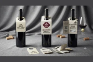
Slip neckers are the simple ones, a die-cut slit that slides right over the neck. Cheapest to produce, most common across wine, beer, spirits, you name it.
Header cards sit a bit higher and bigger, usually reserved for promotions that need more room than a slip necker can offer.
Interactive neckers get more creative, QR codes, scratch-off panels, small folded sections that reveal something once opened. Costs more to print these, but people tend to hold onto them longer, which matters if the goal is getting someone to actually act on what’s printed there.
Design Choices That Make or Break the Format
One message. That’s really the rule most brands break first. Cram three offers and two logos onto a necker and people just tune the whole thing out, same as junk mail. Say one thing clearly and it actually gets read.
The other mistake is treating the necker like it belongs to a different brand entirely. If the colors and fonts clash with the bottle’s actual label, it looks bolted on at the last minute by someone in a rush. Keep it visually consistent and it reads as part of the product instead of an add-on nobody asked for.
Where Neckers Genuinely Earn Their Keep
Seasonal campaigns are probably the best use case going. A small holiday recipe or a gifting suggestion gives someone a reason to grab that specific bottle over the one sitting right next to it, especially if they’re already shopping with an occasion in mind.
Limited-time offers work well here too, mostly because neckers are cheap enough to print in short runs. No need to commit to a big label redesign for a discount that’s only running three weeks.
There’s a less obvious use too, one that gets skipped a lot. A necker with a QR code pointing to a quick survey or an email sign-up turns a random one-time purchase into something a brand can actually follow up on later. And if different batches carry different codes, it becomes fairly easy to see which design or message actually got people scanning, which is useful info heading into the next print run.
What Tends to Go Wrong
The biggest one is just overloading the thing, treating it like free advertising space instead of one focused message. The second is ignoring physical fit, a necker cut too tight tears the moment someone picks up the bottle, too loose and it just falls off before the bottle even reaches a shelf. And then there’s print quality. A necker printed on flimsy paper undercuts whatever premium feel the brand worked hard to build everywhere else on the bottle.
Making the Most of Not Much Room
Copy needs to stay short, a phrase or a single sentence usually beats a paragraph nobody’s going to stand around reading in an aisle. And it’s worth testing more than one version too, running two or three necker messages across different store locations is a cheap, low-risk way to figure out what actually gets people to buy, rather than guessing.
Final Thoughts
That wine bottle at dinner didn’t sell itself through the label sitting right there in plain sight. It sold itself through a small piece of card hanging off the neck that gave a few people a reason to pick it up and start a conversation about it. That’s basically the entire case for bottle neckers in one sentence. Cheap, small, and quietly doing more work than most brands ever give them credit for.



