
I once watched someone in a shop pick up two boxes of chocolate, put one back without even reading the label, and walk out with the other. That’s the whole game right there. Nobody had tasted anything yet. The decision was made by a box.
Packaging isn’t decoration you slap on at the end. It’s doing actual work — telling people what to expect, making a $12 bar feel worth $20, and keeping the chocolate from turning into a melted mess before it gets to someone’s kitchen table. Get it wrong and none of the rest matters.
Why Bother Going Custom
Stock boxes are fine if you’re just trying to survive your first few months. I get it, money’s tight early on. But there’s a ceiling to what a generic box can do for you, and most brands hit it faster than they expect.
First Impressions Happen Before the Wrapper Comes Off
People decide something’s premium before they’ve eaten a single square. The paper texture, the way the lid lifts off, the little resistance of a magnetic clasp — all of that is doing the convincing. It sounds shallow, but it’s true, and every luxury brand you can name has built its whole pricing strategy around this exact fact.
Shelves Are Crowded and Nobody’s There to Pitch for You
Go stand in a chocolate aisle sometime. Twenty brands, all fighting for the same three seconds of attention. Your box has to make the case for itself because you’re not standing next to it explaining why yours is better.
The Unboxing Thing Is Real, Not a Trend Anymore
People film themselves opening boxes now. Ribbon pulls, wax seals, that little pause before the lid lifts — it’s basically free advertising if the packaging earns it. If it doesn’t, nobody’s filming anything and that opportunity just evaporates.
Picking a Material That Actually Fits
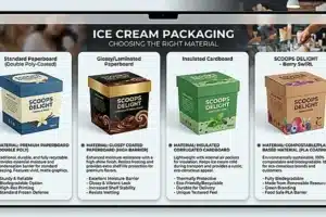
There isn’t a “correct” material. There’s just what fits your product and your price point.
Rigid Boxes
These are the thick, sturdy ones that don’t collapse flat — the kind you’d use for a holiday gift set or a corporate order. They cost more to produce but they feel expensive in the hand, which honestly is half the point of buying them in the first place.
Folding Cartons
Cheaper, lighter, ship flat so you’re not paying to move air around in a truck. This is what most standard chocolate bars come in, and there’s genuinely nothing wrong with that — not every product needs to feel like a jewelry box.
Kraft Paper
If your whole thing is organic or fair-trade or “we don’t use weird ingredients,” kraft paper does a lot of the talking for you. That plain brown look has become shorthand for honest, even before anyone reads the ingredient list.
Keeping the Chocolate From Falling Apart
None of the design work matters if the chocolate shows up bloomed, melted, or stale. Chocolate’s fussier than people think — it absorbs moisture, it hates heat, it picks up smells from whatever’s near it in a warehouse.
Outside threats:  oxygen, moisture, light, heat
                              |
                              v
   Barriers that stop them:  foil wraps, food-safe trays, sealed liners
                              |
                              v
                    Chocolate that's still fresh


Moisture Is the Enemy
That dull white coating you sometimes see on old chocolate — sugar bloom — usually comes down to moisture getting where it shouldn’t. A decent foil liner or glassine layer solves most of this before it starts.
Light and Heat Do Damage Fast
Leave a box in a hot delivery van for a few hours and you’ll see the problem yourself. Darker, opaque packaging blocks enough UV and heat to make a real difference.
Trays Aren’t Just for Looks
Molded inserts stop truffles from banging around and chipping. Doesn’t sound like a big deal until someone opens a box of individually crafted pieces and half of them are cracked.
The Design Choices Worth Spending Time On
Typography
A clean sans-serif reads modern and minimal. A flowing script says old-world luxury. Whatever you pick sets expectations before the box is even open, so don’t just default to whatever font came free with your design software.
Color
Gold and black are the obvious luxury cliché — and yes, it’s a cliché, but it works, which is why everyone keeps using it. Pastels suit fruit-filled or milk chocolate, anything meant to feel light and fun. Earth tones fit dark, single-origin bars where the story is about the beans and where they came from.
Finishing Touches
Foil stamping, embossing you can feel with your thumb, a glossy spot-UV patch against a matte background — these cost extra, and they’re usually worth it. This is the stuff that separates “nice box” from “box someone keeps on a shelf afterward.”
Sustainability Has Stopped Being Optional
Customers care about where the packaging ends up, not just what’s inside it.
| Packaging Component | Traditional Option | Sustainable Alternative |
|---|---|---|
| Outer box | Plastic-coated board | FSC-certified recycled cardboard |
| Internal tray | Virgin plastic | PLA (cornstarch-based) or molded fiber |
| Printing inks | Petroleum-based | Soy- or water-based |
| Inner wrap | Aluminum or plastic film | Compostable cellulose film |
Making these swaps usually pays for itself in loyalty. It’s one of the rare situations where doing right by the planet and doing right by your margins aren’t actually in conflict.
Finding a Manufacturer Who Won’t Let You Down
Check Their Food-Safety Certification First
Not negotiable. If they can’t prove compliance for direct food contact, walk away, no matter how good their sample photos look.
Ask About Minimum Order Quantities Early
Rigid boxes especially come with steep MOQs sometimes. If you’re small, look for suppliers doing digital printing — shorter runs, less risk if a design doesn’t land.
Get a Real Prototype Before You Commit
A digital mockup on a screen tells you nothing about how the box actually holds together with real chocolate sitting inside it. Ask for a physical sample every time. No exceptions.



