
Eye-Catching Custom Donut Boxes
There’s this donut place near my old apartment, and honestly? The donuts are fine. Not amazing. I’ve had better from a grocery store bakery, no joke. But their box has this loud pink pattern with a little cartoon donut winking at you, and I bought from them constantly. Every single week practically. Not for the donuts. For the box, mostly, if I’m being totally honest with myself.
That’s sort of embarrassing to admit but it’s also exactly the point of this whole article.
People decide with their eyes way before their mouth ever gets involved. The box is doing half the selling, sometimes more than half, before anyone’s even lifted the lid.
And yet so many bakeries treat the box like an afterthought. Grab the cheapest option, slap a sticker on it, move on with the day. Which is kind of a waste, because out of everything you could upgrade in a bakery, packaging is one of the cheapest wins available.
Why the Box Carries More Weight Than People Think
Donuts, most of the time, are an impulse thing. Nobody’s planning their donut order three weeks out on a calendar. You walk past a shop, something catches your eye, decision made in about four seconds.
Plain white box, maybe a sticker, and you’ve blended into every other bakery on the block. Customers form an opinion about your quality before the lid’s even open, and that first impression sticks around longer than you’d think.
There’s also the whole social media thing. Donut photos are everywhere, weekends especially, holidays even more so. A box that actually looks good practically guarantees your product ends up in someone’s feed. Free advertising, basically, and you didn’t have to do anything except design a decent box.
And honestly, buying donuts is usually tied to something good. Birthdays, weekend treats, someone had a rough week and needed a small win. The box should match that mood. A boring box kind of undercuts the whole moment.
What Actually Makes a Box Eye-Catching
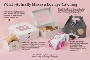
Not every loud design works, to be clear. Some boxes try way too hard and end up looking like a mess instead of appealing. There’s a real line here.
Color
Warm, bright colors tend to work well, pinks, yellows, soft pastels, sometimes a bold contrast combo if you’re feeling brave. The point is standing out on a counter or shelf without fighting with the donuts themselves for attention.
The Window Trick
A simple clear window cuts through basically everything else on this list. People want to see what they’re buying. Letting the donuts peek through builds trust instantly, and it just makes people hungrier looking at it, which, obviously, helps.
Fonts and Type
Playful, rounded lettering usually suits a donut shop, though a sleeker font can work fine for a fancier bakery charging more per box. Whatever you pick, just stay consistent so people recognize your stuff without reading the name.
A Little Personality Goes a Long Way
A mascot, a sprinkle pattern repeating around the edge, hand-drawn little donut doodles, whatever. Small stuff like this turns “here’s your food” into “we clearly enjoyed making this for you,” which sounds cheesy but it works.
The Practical Stuff People Forget
A gorgeous box that doesn’t actually function ends up annoying customers more than it impresses them.
Size has to match what’s inside. Too big and donuts slide around, bang into each other, arrive looking sad. Too small and you’re squishing the lid shut, which, again, sad donuts. Getting this right matters way more than most bakeries realize until the complaints start coming in.
Grease is just part of the deal with donuts, there’s no getting around it. A box without proper grease-resistant coating turns soggy and gross-looking within an hour, no matter how nice the print looked in the design file.
And if you’re doing delivery or big catering orders, the box needs enough backbone to stack without collapsing. Weak cardboard ruins the whole presentation the second someone opens a box that got crushed in transit.
Branding the Right Way, Not Just a Logo Somewhere
Branding a donut box is more than tossing your logo in a corner. That’s the bare minimum, and a lot of small bakeries stop right there.
Keep the logo visible, sure, but don’t let it swallow the whole design. Let your colors and illustration actually breathe a little, your name will still get remembered without needing to dominate the box.
Match the packaging to your shop’s actual vibe. A colorful, kid-friendly bakery needs completely different packaging than an upscale place selling artisan donuts for six dollars each. Both can be eye-catching, just in totally different directions.
Small extras matter too. A thank-you note printed inside the lid. A fun little fact about your ingredients. A QR code pointing to your Instagram. Tiny touches, but they turn a box into an actual moment of connection instead of just a container.
Material, and What It’s Actually Worth Spending On
You don’t need the fanciest option to make an impression, but material does shape how premium your brand feels in someone’s hands.
Standard kraft boxes are affordable, print well enough, and honestly give off a nice homemade feel that suits a lot of smaller bakeries perfectly. Coated or laminated options cost a bit more, but that glossy or matte finish holds up way better against grease and just looks cleaner, worth it if you’re running a premium line.
For gift boxes or special orders, custom inserts that hold each donut in its own spot stop them from sliding around and touching each other. Matters a lot more once you’re charging premium prices for a curated box.
Mistakes I See Constantly
Same handful of issues come up again and again with bakeries trying to level up their packaging.
Cramming in too many colors, fonts, and graphics all competing at once ends up looking cluttered instead of appealing. One or two strong focal points, cleaner design, tends to perform better every time.
People also forget the actual unboxing moment matters. Does the lid open easily? Did the donuts survive the trip intact? Does the box smell like anything besides fresh donuts? These small details shape the impression just as much as whatever’s printed on the outside.
And skipping consistency across your product line is a common one too. If your dozen box looks nothing like your single bag, you lose that instant recognition. Keep a thread running through all your sizes.
If You’re Redesigning, Here’s Where I’d Actually Start
Check what other bakeries around you are doing, not to copy them, just to make sure your box isn’t blending into the same shelf as everyone else’s.
Get a small test batch printed before ordering thousands of units, and ask actual regular customers what stands out, what feels off. Small tweaks based on real feedback save a lot of money down the line, trust me on that one.
And don’t sleep on sustainability. More people care about recyclable or biodegradable packaging than they used to, genuinely. A bakery that leans into eco-friendly boxes can turn that into a real selling point, not just a footnote nobody reads.
Bottom Line
A donut box isn’t just a container to get your product home safely. Often it’s the first real interaction someone has with your brand, and sometimes it’s the entire reason they picked your shop over the one across the street.
If you’re serious about growing your bakery, give the box the same attention you give your recipes. The ones who actually do this notice the difference in foot traffic and repeat customers a lot sooner than they’d expect.



