
Okay, so here’s something I noticed a while back and haven’t been able to unsee since. Two makeup brands, basically the same formula, same price point, same target customer. One was doing fine. The other was doing really well. The difference? The box. Not the product. The box.
That sounds a little insane if you haven’t sold anything online before, but ask literally anyone who’s run a beauty brand and they’ll tell you the same thing — people decide how they feel about your product before they even get the lid off. Custom makeup boxes aren’t just packaging, they’re basically your first sales pitch, and most brands don’t treat them that way until it’s too late.
I want to walk through what actually makes a makeup box feel special versus what makes it feel like an afterthought, because there’s a real difference and it’s usually not about spending more money.
The Box Talks Before the Product Does
Makeup is emotional. Nobody strictly needs another lip gloss. People buy it because it makes them feel like a slightly better version of themselves for a minute. So when your box shows up looking cheap or generic, it kind of undercuts that whole fantasy before it starts.
I’ve genuinely seen this happen — a product that was better than a competitor’s, ingredient for ingredient, still got worse reviews because customers assumed it was inferior based on the packaging alone. That’s not fair, but it’s real, and it’s exactly why this stuff matters more than people give it credit for.
Figure Out the Material Before You Touch a Single Colour
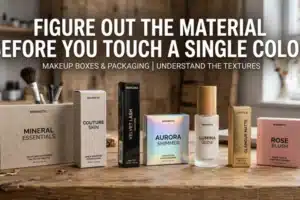
This is where a lot of people mess up the order of operations. They open Canva, pick a font, choose a palette… and only later realize they haven’t decided what the box is actually made of. Backwards.
Kraft paper is the easy answer if you want that clean, natural, slightly earthy look — cheap enough, sturdy enough, and it photographs nicely for that “we care about the planet” aesthetic everyone’s going for lately. Rigid boxes are the heavier hitters, literally and figuratively. If you’re positioning your brand as premium or luxury, this is basically mandatory. It costs more, sure, but it feels expensive in a way that thin folding boxes just can’t fake. And if you’re shipping a lot — like actually mailing product to people’s houses — corrugated cardboard needs to be part of the plan, or you’ll be refunding broken compacts every other week.
Honestly, ask yourself where the product spends most of its life. Sitting pretty on a store shelf, or bouncing around in a delivery van? That answer decides half your packaging strategy right there.
Oh, and the eco-friendly angle isn’t just something brands say to sound nice anymore. People genuinely check for it now, especially younger buyers. Even a small recyclable label tucked in the corner does more trust-building than you’d expect for something that costs almost nothing to add.
Less Is More, Design-Wise (Seriously)
There’s a version of this article where I list out ten design rules in bullet points, but honestly the whole thing boils down to one instinct most brands ignore: stop trying to fit everything onto one small box.
I’ve seen boxes with three fonts, a pattern, a slogan, ingredient text crammed into six-point font, and a QR code all fighting for space. It’s exhausting to look at. Pick one strong visual idea and let it breathe.
Color should match the personality of the product, not just whatever’s trendy on Pinterest that month. A bold, slightly rebellious brand should lean into contrast — black with gold foil, deep reds, maybe a matte black finish that feels a little dangerous. Something softer and more skincare-adjacent works better in pastels with a satin sheen. The box needs to feel like it belongs to the product, not like it was slapped on separately.
Fonts matter more than people think too. That gorgeous cursive script you fell in love with in your mockup? Great, as long as someone can actually read your brand name from a few feet away on a shelf. Legibility beats style every single time, even when it’s tempting to go the other way.
And a small die-cut window showing the actual lipstick shade or eyeshadow color does something almost sneaky — it removes hesitation. Especially for online shoppers who can’t swatch the product themselves before buying. It’s a tiny design choice with a surprisingly big effect on returns.
Structure Is Not Just About Looking Pretty
A stunning box that falls apart in transit isn’t actually a good box, it’s just a good-looking problem.
Foam inserts, molded trays, simple cardboard dividers — whatever keeps the product from rattling around and cracking during shipping. Nobody writes a glowing review after opening a box to find a shattered eyeshadow pan, no matter how nice the exterior looked.
If your margins can handle it, magnetic closures are worth every extra cent. That soft click when the lid shuts is such a small detail, but people notice it, and it makes even a routine reorder feel a little bit like unwrapping a gift. Sleeve-style boxes work particularly well for bundles too — sliding the tray out adds a bit of drama to the reveal, which fits right into how emotional makeup shopping already is.
The Small Finishing Touches Do a Lot of Heavy Lifting
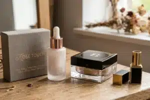
Once material, structure, and colors are locked, the finishing choices are what separate “fine, I guess” from genuinely ravishing.
Matte finishes give off that quiet luxury feel. Glossy works better for younger, more playful brands. Foil stamping in gold or rose gold adds a touch of glam without going overboard, and embossing your logo gives people something tactile — sounds like a minor detail, but it’s the kind of thing that makes a box feel deliberately made rather than just printed and shipped.
You don’t need all of these at once, by the way. Pick one, maybe two, and let them actually stand out instead of competing with each other.
Don’t Forget People Actually Have to Open the Thing
A box that photographs beautifully for an Instagram unboxing video but takes ten minutes and a pair of scissors to actually open isn’t doing its job. Customers notice ease of use more than brands assume — smooth opening, a lid that reseals for storage later, a size that doesn’t waste cardboard on empty air inside. That kind of practical thoughtfulness quietly builds loyalty in a way flashy design alone never will.
Keep the Whole Product Line Talking the Same Language
If you’re selling more than one product, keep your visual identity consistent across the board — similar fonts, similar logo placement, a shared color family with just enough variation to tell products apart. This is genuinely how customers start recognizing your brand on a crowded shelf before they’ve even read a single label.
So, Where Does That Leave You
Ravishing custom makeup boxes aren’t about throwing money at flashy finishes and hoping something sticks. It comes down to picking the right material first, showing some restraint in the design, adding a few smart structural choices, and finishing it off with details that feel intentional. Nail that combination, and your packaging stops just holding your product — it starts helping sell it.



