
A few years back I got handed a business card at some random event, thick paper, and I kept running my thumb over the logo without even noticing I was doing it. Raised up off the card. Like braille almost. Had no clue what it was called till I flat out asked the guy who printed it for me. Embossing. That was it. One little detail and suddenly the card felt way more expensive than it probably cost him.
If you’ve felt that on packaging or a card before and wondered what it’s actually called, or you know both words already but keep mixing up which one pushes up and which presses in, this’ll clear it up.
What Embossing Actually Means
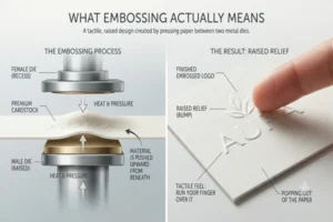
Embossing pushes the design up above the surface. Run your finger over it and there’s a bump there, like the logo’s popping slightly out of the paper.
Uses a metal die for this, pressed from underneath, sometimes with heat depending on the material. Die shoves the material up from behind so the front ends up with a raised shape.
Where You’d Normally See It
Wedding invitations, a lot. Nice packaging too, premium business cards, hardback books where the title’s raised on the cover. Pretty much anywhere a brand wants to look expensive without going crazy with color.
Debossing Is Kind of the Opposite
Debossing flips it. Design gets pressed down into the material instead, so what you get is an indent, not a bump.
Same tools really, die and pressure, just coming from the top instead of underneath this time. Ends up looking sunken in rather than raised.
Where This One Pops Up
Leather mostly. Wallets, notebook covers, stuff like that where a logo’s pressed straight into the leather. Corporate stationery does this a lot too. Minimalist brands especially like debossing on purpose, it’s subtle, doesn’t scream for attention the way a raised logo does.
What’s The Actual Difference Then
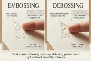
Short answer, embossing pushes up, debossing presses down. That’s basically it honestly. Everything else just branches off that one point.
Light Hits Them Differently, Weirdly Enough
Something people don’t clock until they see it in person – an embossed logo throws a shadow underneath the raised part. Debossed ones make a tiny shadow inside the dent instead. Depending how light’s hitting it, one can look way more dramatic even with the exact same design underneath.
And Honestly They Just Feel Different Too
Embossing’s louder, kinda “look at me.” Debossing’s quieter, more low key. Neither’s better than the other, just depends what your brand’s going for I guess.
So Which One Do You Actually Pick
Most people get stuck right here cause both look good depending where you’re using them.
Embossing Makes Sense If
You want premium and don’t mind being a little loud about it. Works great on thicker paper, gift boxes, anything you want physically standing out – sometimes people pair it with foil too for extra shine.
Debossing Makes Sense If
You’re going more minimal, understated, maybe a bit rustic even. Looks really good on kraft paper, leather, matte finishes, anywhere you don’t want shine or too much contrast. Just a quiet mark saying “yeah this is decent quality” without shouting about it.
Does The Material Even Matter Here
Yeah actually, more than you’d think. Not every material takes both techniques the same.
Thick cardstock and leather handle either one fine, enough material there for the die to press into without tearing anything. Thin paper’s more of a problem, especially with embossing, pushing a raised shape into something flimsy can weaken it or even tear a little around the edges.
You Can Mix Both Actually
Some designs do embossing and debossing together, combination stamping is what it’s called. Part of the logo pops up, another part presses in, gives it this layered, almost 3D thing going on. Costs more, needs a way more precise die too, but looks genuinely great when done right.
Costs More Than Regular Printing, Right
Yeah, no way around that honestly. Dies aren’t cheap to make especially for detailed designs, and pressing just takes more machine time per piece than running ink over something flat.
But for small batches of premium stuff, special editions, that extra cost usually pays for itself. People actually notice it. Kind of the whole reason brands bother with it in the first place, making something feel worth what it costs.
Couple Tips If You’re Actually Doing This
Keep it simple first time round. Detailed logos with thin lines don’t always press clean, can end up blurry or uneven looking.
Test on the actual material you’re gonna use before ordering a huge batch. Something that looks amazing embossed on thick cardstock might look totally different debossed on thin kraft paper. Don’t just assume either one works the same everywhere, cause it doesn’t.
Wrapping This Up
Embossing and debossing both do pretty much the same job at the end of the day, adding texture and some premium feel to your packaging or print stuff, just in opposite directions from each other. One pushes up, one presses down, and picking between them really just comes down to what feeling you want your brand giving off.
Not sure which one fits better? Order a couple small test samples before committing to a full run. Saves a lot of headache later on.



