
Introduction
Your product has three seconds on the shelf to make a customer pick it up.
In those three seconds, color catches the eye — but typography closes the deal. The fonts you choose, how you arrange them, and how readable they are under retail lighting directly shapes whether a shopper sees your product as premium, trustworthy, fun, or forgettable.
Packaging design typography is not just about picking a pretty font. It is a strategic system that communicates your brand’s personality, guides the reader’s eye, and ensures legal compliance — all on a surface that could be smaller than your palm.
This guide covers everything you need to know: the fundamentals of type hierarchy, how to pair fonts, what mistakes to avoid, and what is working in 2026.
What Is Packaging Design Typography?

Packaging design typography is the art and science of selecting, arranging, and styling typefaces on a product’s packaging. This includes:
- The brand name and logo lockup
- Product name and variant descriptions
- Taglines and marketing copy
- Ingredients, nutritional facts, and usage instructions
- Legal disclaimers, barcodes, and regulatory text
Each layer of text on your packaging serves a different purpose, speaks to a different reader, and demands a different typographic approach. Getting the system right means your packaging communicates instantly, clearly, and consistently.
Why Typography Is the Most Underestimated Element in Packaging
Most brands obsess over color and imagery. Typography gets treated as an afterthought — something to fill in after the “real” design is done.
This is a costly mistake.
Here is why typography deserves to be the first decision you make, not the last:
It communicates brand personality instantly. A bold slab serif says “strong and dependable.” A delicate script says “handcrafted and personal.” A clean geometric sans says “modern and confident.” Before a customer reads a single word, the shape of your letters has already told a story.
It controls what customers read first. Through size, weight, and placement, typography tells the eye where to go. Without a clear hierarchy, shoppers get confused — and confused shoppers put the product back.
It builds brand recognition across an entire product line. When your font system is consistent, a customer recognizes your brand in a split second even from across the aisle. Think of how immediately recognizable Coca-Cola’s script is, or how Apple’s clean sans-serif signals its entire philosophy.
It affects regulatory compliance. Food, pharmaceutical, and cosmetic packaging must meet strict minimum type size requirements. Poor typography planning can create costly compliance problems.
The 4 Layers of Typographic Hierarchy in Packaging
Every effective packaging system uses a clear four-layer hierarchy. Set this structure before you choose a single font.
Layer 1 — Brand Name
This is your largest, most distinctive typographic element. It should be immediately recognizable and consistently placed across all SKUs. This is where custom typefaces or strongly branded typefaces live.
Layer 2 — Product Name and Variant
Secondary emphasis. Customers need to understand what the product is and which variant it is (flavor, size, strength). Slightly smaller than the brand name, but still highly legible.
Layer 3 — Supporting Copy and Claims
Taglines, key benefits, marketing claims. These should reinforce the brand voice and speak to the customer’s motivation. Use this layer to sell, not to inform.
Layer 4 — Functional and Regulatory Text
Ingredients, nutritional information, usage instructions, legal copy. This layer must meet regulatory minimum sizes and prioritize legibility above all else. Beauty here is secondary to clarity.
How to Choose the Right Fonts for Your Packaging
Understand Font Psychology First
Different typeface styles carry different emotional signals:
- Serif fonts (Times, Garamond, Playfair Display) — traditional, authoritative, premium, trustworthy. Strong choice for food, spirits, skincare, and heritage brands.
- Sans-serif fonts (Helvetica, Futura, Gill Sans) — modern, clean, approachable. Works across almost every product category.
- Script and handwritten fonts — personal, artisanal, romantic. Excellent for craft food and beverage, gifting, and indie brands. Use sparingly on small text.
- Display and decorative fonts — bold, distinctive, memorable. Best reserved for brand names only. Never use for body copy.
- Monospace fonts — technical, precise, utilitarian. Increasingly used in pharmaceutical and tech-adjacent packaging.
The Rule of Two Typefaces
Stick to a maximum of two complementary typefaces per packaging system. More than two creates visual chaos and dilutes brand identity.
The most reliable pairing strategy: one expressive typeface for brand identity and headlines, paired with one highly legible typeface for all functional and body copy. The two fonts should contrast enough to create visual interest but share enough underlying character to feel cohesive.
Test Your Fonts Under Real Conditions
A font that looks beautiful on a screen can completely fall apart on a curved surface, under fluorescent retail lighting, or when printed at small sizes. Before committing to a typeface:
- Print it at actual packaging scale
- Check legibility from arm’s length and shelf distance
- Test it on curved and irregular packaging surfaces
- Confirm it meets regulatory minimum size requirements at small sizes
Typographic Spacing: The Detail That Separates Good from Great
Even a perfect font choice fails without proper attention to spacing. Three spacing variables control the quality of your packaging typography:
Kerning — the space between individual letter pairs. Poor kerning makes your packaging look amateurish. Most professional typefaces have solid built-in kerning, but display-size brand names should always be kerned manually.
Tracking — the overall spacing across a word or line. Wider tracking on small caps and fine-print copy improves legibility significantly. Tighter tracking on display headlines creates a premium, confident look.
Leading — the vertical space between lines of text. On packaging, where copy is dense, generous leading makes functional text far more readable and approachable.
Contrast and Color: Typography’s Hidden Legibility Variable
Font choice alone does not determine legibility. Color contrast between your text and background determines whether your packaging can actually be read.
WCAG accessibility standards recommend a 4.5:1 contrast ratio for body text. On packaging, this standard is a practical baseline, not just an accessibility concern. Poor contrast fails under retail store lighting and makes functional copy genuinely unreadable.
When placing type over images or colored backgrounds:
- Test contrast at the lightest and darkest points of the background
- Avoid placing body copy over highly detailed photographic backgrounds
- Use text boxes, color blocks, or overprint treatment to ensure consistent contrast
- Never rely on outline-only type for small text — it lacks sufficient contrast
Packaging Typography for Different Product Categories
Food and Beverage
Readability for nutritional information is legally required. Use clean, high-contrast functional typefaces for the information layer. The brand voice layer can be more expressive, but should feel relevant to the product’s positioning (artisan, premium, everyday, etc.).
Luxury and Premium Products
Refined serif fonts, generous white space, and restrained use of type. Less is more. Luxury packaging often uses very few words — every word and every font choice is deliberate.
Health, Wellness, and Pharmaceutical
Clarity and trust are everything. Regulatory compliance is non-negotiable. Sans-serif typefaces with excellent legibility are standard. Minimal decoration. Precise information hierarchy.
Children’s Products
Bold, friendly, rounded letterforms. High contrast, large type sizes. Typography can be playful but must remain readable. Avoid overly decorative scripts that obscure the message.
Natural and Organic Products
Hand-drawn, imperfect letterforms are on a significant rise in 2026. Organic-feeling typefaces signal authenticity and craft. Avoid overly polished, corporate type systems for brands in this space.
2026 Typography Trends in Packaging Design
Typography-Led Packaging
An increasing number of brands are removing logos and illustrations entirely, letting the brand name and its typographic treatment carry full identity responsibility. This approach performs exceptionally well in both physical retail and digital-shelf environments.
Bold, Heavy Weights
Thin, delicate type has given way to confident, heavy letterforms. Chunky type holds up better under glare, compression, and the visual noise of a crowded shelf.
Intentionally Imperfect Typography
Hand-drawn lettering, typewriter styles, and asymmetric layouts signal human craft in an era of AI-generated content. In 2026, deliberately imperfect typography is a trust signal, not a design flaw.
Custom Brand Typefaces
Major brands are investing in proprietary typefaces developed exclusively for their identity. Custom typefaces cannot be replicated by competitors and embed brand recognition directly into every piece of packaging. For brands without the budget for bespoke development, strongly distinctive licensed typefaces from established foundries are a practical alternative.
Bilingual and Multilingual Typography Systems
As brands expand into global and multicultural markets, packaging typography systems must accommodate multiple scripts without compromising hierarchy or brand character.
Common Packaging Typography Mistakes to Avoid
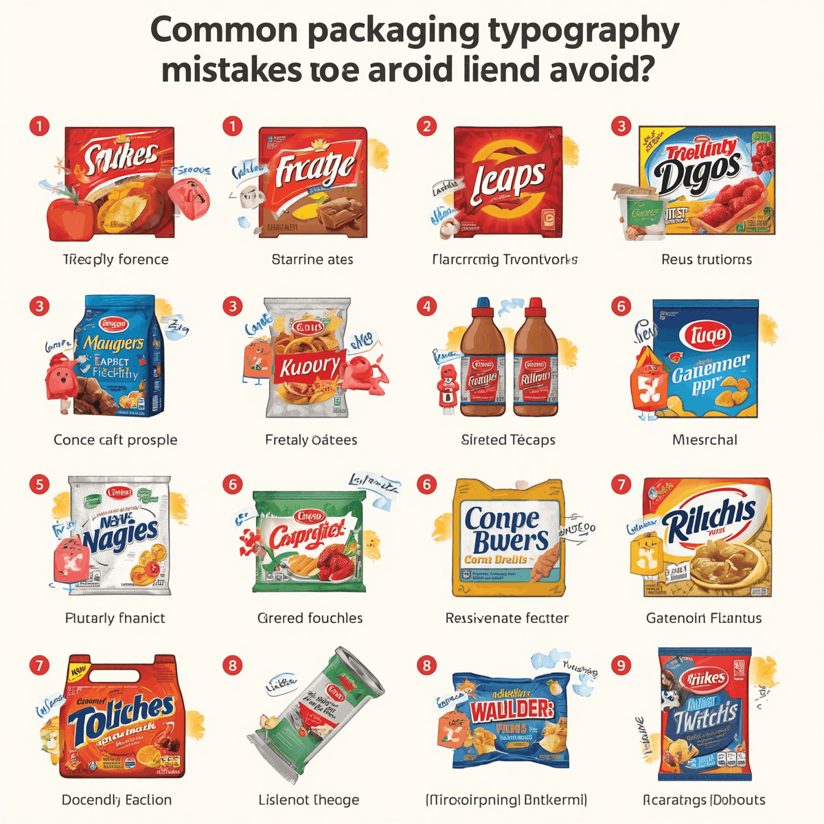
Using too many fonts. More than two typefaces creates visual chaos. Every additional font dilutes your brand identity.
Ignoring print scale. Type that looks elegant on screen can become illegible at the small sizes required on actual packaging. Always test at real scale.
Low contrast on functional copy. Regulatory text, ingredient lists, and nutritional information must be readable. Low contrast is a compliance and usability failure.
Choosing decorative fonts for body copy. Decorative and display typefaces exist for headlines and brand names. Using them at body copy sizes sacrifices legibility.
Inconsistent font usage across a product line. If your typography changes from SKU to SKU, your brand recognition breaks down. Define a type system and apply it consistently.
Neglecting license terms for packaging. Many typeface licenses are web-only and do not cover commercial packaging use. Always verify packaging rights before production.
Building a Packaging Typography System
A strong packaging typography system documents the decisions your brand has made so they can be applied consistently across every product, market, and production cycle. Your system should define:
- Primary and secondary typefaces with specific weights
- The four-level typographic hierarchy with size guidelines
- Color and contrast standards for type on all approved backgrounds
- Minimum type sizes for functional and regulatory text
- Spacing standards for kerning, tracking, and leading
- Rules for how typography adapts across packaging formats and sizes
When your typography system is documented, every designer, printer, and packaging supplier works from the same rules — and your brand stays consistent.
Final Thoughts
Typography is the voice of your packaging. It tells customers who you are before they read a word. It guides them through your product’s story in the right order. And it earns their trust by being clear, consistent, and intentional.
The brands winning on shelf in 2026 are those that treat typography as a strategic system — not a finishing step. They know which typefaces carry their brand’s personality. They set hierarchy before they open a design file. They test at real scale before they commit to print.
If your packaging typography is working, customers do not notice it. The information flows naturally. The brand feels right. The product gets picked up.



