
5 Cool Product Sleeve Ideas to Elevate Your Brand Packaging
Take a stroll down any store aisle and watch what you see: The first items that attract your attention won’t necessarily be the biggest, but they will be the clever ones that have an eye-catching sleeve packaged around them. If this happens with a product, a well-designed sleeve can change the way it feels in a person’s hands before they even open the box.
From materials to design strategies, this guide delves deep into what sleeve design is really good for, and how to leverage it to get products to the consumer, not just look pretty.
What Is a Product Sleeve, Exactly?
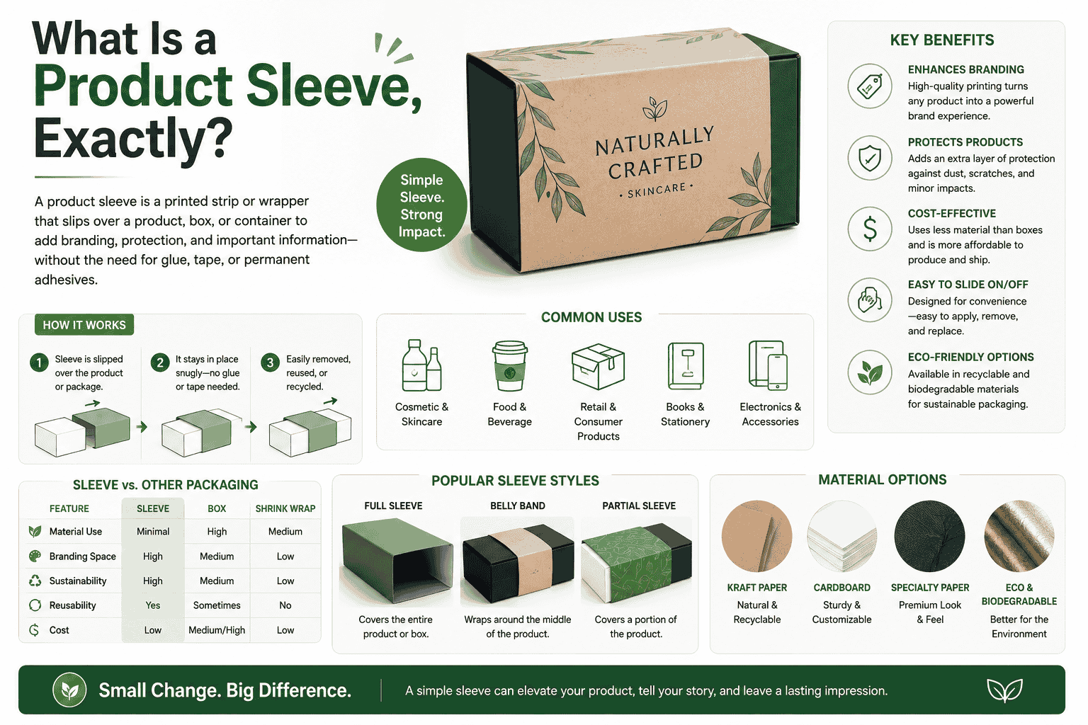
A packaging sleeve is a band or wrap that goes over an already existing box, container, or bag. It gives you branding, information, and/or visual interest without having to rethink your whole packaging design.
From soap to electronics, foodstuffs to apparel, cosmetics to more, sleeves are utilized in a wide variety of products. They’re popular for a couple of practical reasons:
- Much less expensive to print and replace than custom boxes
- New seasonal designs can be changed without having to change the entire packaging line.
- They allow boxes to be clearly branded without having to put anything on them.
-
Go Minimal — and Mean It
In packaging debates, minimalism has been used a lot, but not so many brands are truly minimalist. They then add “clean” design and then throw so many fonts, colors, or a marketing paragraph on the page, which very few people will read.
A good minimal sleeve serves two purposes: it names the product, and it looks good. That’s it.
Consider packaging for luxury skin care or specialty food items. This sleeve is usually white or kraft paper, in one or two colors in most cases, and may have only one prominent logo and perhaps a limited description. No taglines. No busy borders. No barcodes getting in the way.No distracting QR codes.
-
Use Texture as Part of the Design
Most people think sleeve design is only visual — it’s not. Texture is one of the most underused tools in packaging.
A matte finish feels different from gloss. Soft-touch lamination feels expensive the moment you pick it up. Kraft paper with embossed lettering has a tactile quality that communicates “handcrafted” without saying a word.
Here’s how texture choices break down in practice:
| Finish | Feel | Best For |
| Matte | Understated, premium | Cosmetics, wellness, premium food |
| Gloss | Bright, bold | Snacks, kids’ products, retail shelves |
| Soft-touch lamination | Luxurious, smooth | High-end candles, skincare, spirits |
| Kraft paper | Natural, rustic | Organic products, handmade goods |
| Embossing / Debossing | Textured depth | Logos, brand names, decorative details |
If your product competes on quality, texture is one of the fastest ways to communicate that before anyone reads a single word on the package.
3. Design for the Unboxing, Not Just the Shelf
A lot of packaging is designed to look good on a shelf display. But increasingly, the unboxing moment matters just as much — especially for e-commerce products or gift-ready items.
Interactive sleeve features take this seriously. A few ideas:
Pull tabs — sleeves with a tab that reveals a message or an inner box underneath. Works well for gift packaging or limited-edition products.
Perforated bands — The customer tears the sleeve to open the product. This gives a satisfying, intentional opening experience rather than just sliding the sleeve off and tossing it.
Hidden messages — Inside the sleeve (usually the inner flap), you print a short note, discount code, or brand story. The customer only sees it when they remove the sleeve. Small touch, strong impression.
Two-part sleeves — The outer sleeve slides off to reveal a different design underneath. Useful for dual-language markets or seasonal products where you want the “gifting” look to differ from the everyday look.
4. Match the Sleeve Style to the Product Category
One common mistake is designing a sleeve in isolation from what it’s packaging. The sleeve and product need to speak the same language.
Here’s what works by product type:
Soap sleeves — Kraft paper or cardboard with a simple band works well. Botanical illustrations, ingredient callouts, and earthy colors perform well in this category. Avoid lamination if you’re positioning the product as eco-conscious — it defeats the messaging.
Candle sleeves — Sleeves here can be taller and more dramatic. Dark backgrounds with foil accents, or clean white with hand-lettered typography, both sell well depending on the brand’s positioning.
Food sleeves (cookies, brownies, snacks) — Appetite appeal matters here. Warm tones, product photography (if budget allows), clear allergen info. The sleeve also needs to be food-safe if it’s in direct or near-direct contact with the product.
Apparel sleeves — These are usually simpler, functioning as a band around folded clothing. A well-placed logo, a care instruction note, and maybe a brand story on the back is enough.
Cosmetics and skincare — This category rewards investment in premium finishes. Soft-touch lamination, spot UV on the logo, or foil stamping on a dark background can make a product look three times its price.
5. Seasonal and Limited-Edition Sleeve Swaps
One of the best uses of sleeve packaging is the ability to swap it out without changing the core product or primary box. This lets you run seasonal campaigns, holiday editions, or promotional tie-ins without incurring full re-packaging costs.
A chocolate brand might use the same inner tray all year but swap the sleeve from a regular design to a festive winter version in December. Same product, completely different shelf presence.
This approach also works for:
- Collaborations with artists or influencers (the sleeve becomes the collaboration canvas)
- Limited runs tied to events, anniversaries, or product milestones
- Market-specific packaging for different regions without changing the product
6. Eco-Friendly Sleeves That Don’t Look Cheap
Sustainable packaging doesn’t have to mean dull packaging. This is an area where a lot of brands miss an opportunity — they go eco-friendly and then design something that looks like an afterthought.
Kraft paper sleeves, recycled board, and soy-based inks can all produce sharp, clean results when designed well. The trick is to lean into the natural texture rather than trying to hide it.
A few approaches that work:
- Leave kraft paper visible as part of the design rather than printing wall-to-wall
- Use one-color printing to reduce ink use while keeping a clean, intentional look
- Add a small “this sleeve is recyclable” icon — customers notice and appreciate it
- Use water-based coatings instead of plastic lamination where possible
Final Thought
Sleeve packaging is one of the more flexible tools in packaging design — it’s cost-effective, easy to update, and can dramatically shift how a product is perceived. The ideas that work best aren’t necessarily the most expensive or the most complex. They’re the ones that fit the product, speak to the right audience, and are executed cleanly.



