
Most shoppers decide how they feel about a product before they’ve read a single word on the box. Color does that work — fast, and mostly without the shopper noticing it’s happening.
That’s not a marketing cliché. It’s measurable. Research on shelf behavior consistently finds that the vast majority of a consumer’s first impression is driven by visual cues, color chief among them. If your packaging color sends the wrong signal, the copy, the ingredients list, and the price tag never get a fair chance — the shopper has already moved on to the next box.
This guide breaks down how packaging color actually influences buying decisions, what different colors tend to communicate, where the “just pick a color you like” approach goes wrong, and how to choose a palette that fits your product instead of fighting it.
Why Color Works on Shoppers Before Logic Does
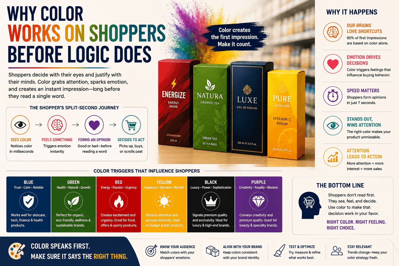
Color perception is processed by the brain faster than language. By the time a shopper consciously registers your brand name, their nervous system has already reacted to your packaging’s hue, contrast, and brightness. That reaction shapes expectations about taste, quality, price, and trustworthiness — before any of those things have actually been evaluated.
Psychologist Louis Cheskin described this phenomenon as sensation transference: people unconsciously transfer their feelings about the packaging onto the product itself. In his classic experiments, identical products in different packaging were rated as tasting, working, or performing differently — purely because of how they were wrapped. The product hadn’t changed. The perception had.
This is why two competitors can sell the same formula, at the same price, on the same shelf, and one consistently outsells the other. Packaging color isn’t decoration. It’s the first argument your product makes.
What Different Packaging Colors Tend to Communicate
Color associations aren’t universal laws — they shift by culture, category, and context — but decades of consumer research show consistent patterns worth building from.
Red — Urgency and Appetite
Red raises heart rate and grabs attention faster than almost any other color, which is why it dominates fast food, snacks, and clearance packaging. It’s tied to excitement, urgency, and impulse buying. Good for products that want to be noticed immediately or bought on impulse. Riskier for premium, calming, or health-focused products, where it can feel aggressive.
Blue — Trust and Calm
Blue is the color most associated with reliability and security, which is why it shows up so often in tech, finance-adjacent products, water, and healthcare packaging. It’s a low-risk, high-trust color — but it can also read as cold or unremarkable if it’s not paired with a distinct shape, texture, or secondary color.
Green — Health, Nature, Sustainability
Green has become shorthand for “better for you” and “better for the planet.” It’s the default choice for organic, eco-friendly, and wellness products for good reason — it works. The risk is oversaturation: in categories like skincare and food, green is now so common that it can blend in rather than stand out.
Yellow — Optimism and Attention
Yellow is one of the fastest colors for the eye to register, which makes it excellent for grabbing attention on a crowded shelf. It reads as cheerful, affordable, and energetic. Used carelessly, it can also read as cheap, so it works best as an accent rather than a dominant color for premium products.
Black — Premium and Sophistication
Black packaging consistently tests as more expensive and more luxurious, even when the product inside is identical to a version in brighter packaging. It’s the go-to for premium beauty, spirits, and electronics. The trade-off: black absorbs shelf attention less than bright colors, so it depends on strong typography or texture to stand out.
Orange — Friendly and Affordable
Orange combines red’s energy with yellow’s warmth, making it feel approachable and fun rather than aggressive. It’s common in value-focused and youth-oriented brands. Like yellow, it can undercut a premium positioning if used at full saturation.
White — Simplicity and Cleanliness
White signals minimalism, purity, and precision. It’s a staple in skincare, medical, and modern tech packaging. Because white shows dirt and damage more visibly in shipping, it also implicitly signals confidence in your logistics.
Purple — Luxury and Creativity
Historically tied to royalty and rarity, purple still reads as premium, imaginative, or slightly unconventional. It performs well for indulgent or artisanal products but is less common in mass-market staples, where it can feel out of place.
It’s Not Just the Color — It’s the Category Fit
The biggest mistake brands make with packaging color isn’t picking an “ugly” color. It’s picking a color that fights the category’s expectations.
A study on food packaging found that warm colors like red and orange boost purchase intent for indulgent “vice” products — think candy, chips, fast food — while cooler colors like blue and green perform better for “virtue” products like health foods and supplements. Put a health snack in aggressive red packaging and shoppers unconsciously expect indulgence, not nutrition — and the mismatch quietly erodes trust even if they can’t articulate why.
The lesson: color psychology isn’t about which color is “best.” It’s about which color matches what your product is promising.
A Quick Reference: Color, Association, Common Use
| Color | Common Association | Works Well For | Watch Out For |
| Red | Urgency, appetite, energy | Snacks, sales, fast food | Premium or calming products |
| Blue | Trust, calm, reliability | Tech, healthcare, water, finance | Can feel generic without contrast |
| Green | Health, nature, sustainability | Organic, wellness, eco products | Category oversaturation |
| Yellow | Optimism, visibility | Value brands, kids’ products, accents | Can read as cheap in excess |
| Black | Premium, sophistication | Beauty, spirits, electronics | Lower shelf visibility |
| Orange | Friendly, affordable, warm | Value products, youth brands | Can undercut premium positioning |
| White | Simplicity, purity | Skincare, medical, minimalist tech | Shows shipping wear |
| Purple | Luxury, creativity | Artisanal, indulgent, premium beauty | Less common in mass-market staples |
Beyond Hue: Saturation, Contrast, and Finish Matter Too
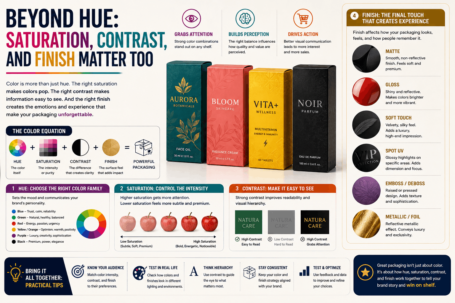
Color psychology discussions often stop at hue — but shade, saturation, and finish carry just as much signal.
- Brighter, more saturated colors feel less serious and more energetic — good for playful or youth-focused brands, riskier for premium positioning.
- Muted, desaturated tones feel calmer and more upscale, which is why so much premium skincare and specialty food packaging leans toward soft sage, blush, and stone tones rather than pure hues.
- Matte finishes tend to read as modern, natural, and premium.
- Glossy finishes read as energetic, bold, and mass-market.
Two boxes in “the same color” can send completely different signals depending on saturation and finish — which is why swatch selection deserves as much attention as the color name itself.
How to Choose Your Packaging Color: A Practical Framework
- Start with the promise, not the palette. What is your product actually promising the shopper — indulgence, health, luxury, reliability, fun? Pick colors that reinforce that promise rather than colors you simply like.
- Check what your category already “owns.” If every competitor on the shelf uses green, standing out might mean deliberately breaking the pattern — as long as the new color doesn’t contradict what the product delivers.
- Test contrast on a real shelf, not just a screen. Colors that look great in isolation can disappear next to competitors. Mock up your packaging next to 3–5 real competitor products before finalizing.
- Consider your customer’s culture and context. Color meaning shifts across regions and demographics — what reads as celebratory in one market can read as somber in another.
- Pair color with material and finish. The psychological effect of a color changes significantly with texture — a matte deep green kraft box reads very differently from a glossy green plastic one, even though the underlying color is nearly identical.
Common Packaging Color Mistakes
- Choosing a color because a competitor uses it, without checking whether it fits your specific product promise.
- Overloading the box with too many colors, which dilutes the psychological signal instead of strengthening it.
- Ignoring accessibility and contrast, making text hard to read against the background color — a design failure that undercuts even a well-chosen palette.
- Redesigning color without testing, the way Tropicana famously discovered in 2009 when a packaging overhaul (including a shift away from its recognizable color and imagery) led to a steep, rapid sales decline before the brand reverted to its original design.
Ready to Design Packaging That Sells on Sight?
Choosing the right color is just the starting point — the material, finish, and structure of your packaging all work together to shape how customers perceive your product. At [Zjpackaging], we help brands translate this kind of research into packaging that actually performs on shelf and online.



