
What are Shipping Symbols & When to Use Them? A Complete Guide!
Open any box that just arrived at your door and there’s a decent chance you’ll see a little glass-with-a-crack icon, or two arrows pointing up, or maybe an umbrella with a raindrop. Most people glance past them. But for the warehouse worker loading a truck at 5 a.m., or the courier stacking forty parcels in a van, those tiny icons are the only instructions they’re going to get. No one’s reading a packing slip mid-shift.
That’s really the whole point of shipping symbols — they replace a paragraph of instructions with a single glance. And if you’re shipping products yourself, using the wrong one (or none at all) is one of the easier ways to end up with a damage claim on your hands.
This guide walks through every standard shipping symbol in use today, grouped the way freight and logistics teams actually group them, plus the ISO standard behind them and how to get them printed correctly on your own packaging.
Why Shipping Symbols Actually Matter (Beyond Looking Official)
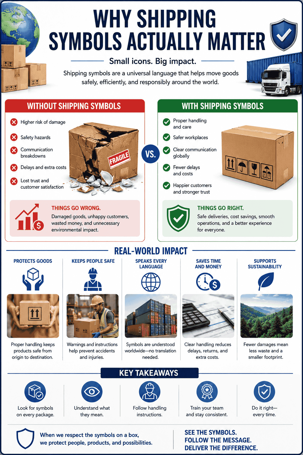
A few numbers make the case better than opinion does:
- Shipments with correctly applied handling symbols see meaningfully fewer transit damage claims, since handlers know how to stack and orient them without opening the box.
- International shipments cross through multiple carriers, customs zones, and languages. A symbol doesn’t need translation — a warning label in English does.
- Insurance and freight claims are easier to file (and win) when the packaging clearly showed the required handling symbol and it was ignored.
In short: symbols aren’t decoration. They’re a liability and damage-control tool that happens to also look clean on a box.
The Four Categories of Shipping Symbols
Every standard shipping symbol falls into one of four functional groups. Knowing the group helps you figure out which symbols your product actually needs — most boxes only need two or three, not all of them.
1. Package Protection & Care Symbols
These describe the physical fragility of what’s inside.
| Symbol | Meaning | Typical Use Case |
| Broken wine glass | Contents are fragile and can shatter | Glassware, ceramics, mirrors |
| Two hands cradling a box | Handle with care — won’t shatter, but can be damaged | Electronics, appliances, cosmetics |
| Two upward arrows | This side up — keep upright at all times | Lab equipment, machinery, liquids |
| Umbrella with raindrops | Keep dry / protect from moisture | Paper goods, electronics, textiles |
| Sun with a box underneath | Keep away from sunlight | Cosmetics, medicine, beverages, film |
| Snowflake or thermometer | Temperature-sensitive contents | Food, pharmaceuticals, chemicals |
| Magnet with a cross through it | Keep away from magnetic fields | Hard drives, magnetic storage media |
2. Environmental Protection Symbols
These aren’t about the shipping process — they cover storage conditions and material sourcing.
| Symbol | Meaning |
| Recycling arrows (chasing triangle) | Box is recyclable or made from recycled material |
| FSC leaf mark | Materials sourced from responsibly managed forests |
| Trash can with a figure | Dispose of properly after use |
| Temperature range icon | Acceptable storage temperature window |
3. Handling Instruction Symbols
These are for the people physically moving the box — forklift drivers, couriers, warehouse staff.
| Symbol | Meaning |
| Two boxes with an X over the top one | Do not stack |
| Stacked boxes with a number | Maximum stack height allowed |
| Person lifting with strained back | Team lift required — too heavy for one person |
| Trolley icon | Use a hand truck or cart, not manual carrying |
| Total weight in kg/lb | Displays the actual package weight |
4. Safety & Hazard Symbols
Mostly governed by separate transport regulations (like IATA for air freight or IMDG for sea freight), these flag anything dangerous.
| Symbol | Meaning |
| Exclamation mark in a triangle | General caution/hazard |
| Flame icon | Flammable contents |
| Skull and crossbones | Toxic material |
| Corrosion icon | Corrosive substance |
Where These Symbols Actually Come From
Most of the icons above aren’t invented by packaging companies — they trace back to ISO 780, the international standard covering graphical symbols for handling and storage of packages. It’s what allows a box printed in Karachi to be understood by a warehouse worker in Rotterdam without either of them speaking the other’s language.
Two other standards worth knowing if you ship internationally or handle regulated goods:
- ISO 3864 — governs the design and color coding of general safety symbols (not shipping-specific, but the visual language overlaps).
- IMDG Code / IATA regulations — required if you’re shipping hazardous materials by sea or air. These have their own mandatory pictograms separate from general handling symbols.
If your product doesn’t fall into a hazardous category, you’re not legally required to use most of these symbols. But carriers and insurers strongly favor shipments that do, and it shows up in fewer disputes when something goes wrong in transit.
How to Choose the Right Symbols for Your Product
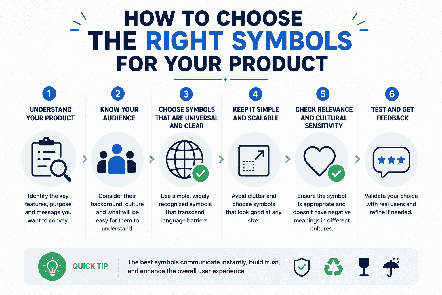
A quick, practical way to think about it:
- Start with fragility. Would this break from a drop? Use the broken-glass symbol. Would it just dent or scratch? Use handle-with-care instead — don’t over-flag, since handlers start ignoring boxes that are covered in warnings.
- Check orientation sensitivity. Liquids, anything with internal components that can shift, or lab equipment usually need the “this side up” arrows.
- Think about the shipping route. Long-distance or international? Add temperature and moisture symbols if remotely relevant — that box could sit on a humid dock for two days.
- Add weight and stacking info if the box is heavy or the material is prone to crushing. This protects both your product and whoever’s lifting it.
- Only add hazard symbols if legally required. Misusing hazard pictograms on non-hazardous goods can actually slow your shipment down at customs.
Custom-Printed vs. Sticker Symbols
You’ve got two ways to get these onto your packaging:
Pre-printed directly on the box — cleaner look, no extra labor at the packing stage, and it reads as more professional to customers unboxing the product. Better for higher-volume runs where the design is stable.
Stickers/labels applied at pack time — more flexible if you ship a mix of fragile and non-fragile products from the same box stock, since you’re not locked into one printed design.
| Factor | Pre-Printed on Box | Applied Labels |
| Best for | High-volume, consistent products | Mixed product lines, variable fragility |
| Setup cost | Higher upfront (print run) | Lower upfront |
| Per-unit cost at scale | Cheaper | Slightly higher per unit |
| Flexibility | Locked into the design once printed | Swap labels per shipment as needed |
| Brand impression | Feels more premium/intentional | Functional, less polished |
If you’re ordering custom boxes anyway, it’s usually worth building the relevant symbols into the print file from the start rather than adding stickers later — it saves a packing step and looks intentional rather than added on.
Common Mistakes Businesses Make With Shipping Symbols
A few patterns that show up constantly with new sellers:
- Using “Fragile” everywhere out of caution. Handlers desensitize to it fast if every box says fragile — reserve it for things that genuinely need it.
- Skipping “This Side Up” on liquids. A surprising number of leak complaints trace back to boxes that got flipped in transit because there was no orientation marking.
- Forgetting stacking limits on lightweight, crush-prone packaging. Boxes with premium finishes (foil, embossing) often get crushed simply because there was no stack limit printed.
- Mixing too many symbols onto a small box. If there are more than four or five icons, most handlers stop reading them individually. Prioritize the two or three that matter most.



