
Picked up a box last week and honestly just liked the way it felt in my hand. Didn’t even know what was inside yet. That’s varnish doing its thing, quietly, in the background, and most people never even clock it.
You only notice packaging finish when it’s bad. Box feels cheap. Colours look dull even though the print file was perfectly fine. Surface gets all scratched up after two days sitting on a shelf. Small stuff like that bugs people even when they can’t really explain why.
So what is it actually. Varnish is a coating that sits on top of the printed surface. Paper, cardboard, paperboard mostly, sometimes other materials too.
It’s doing two jobs really. Making the print look sharper and also stopping the box from getting wrecked while it gets thrown around in trucks and warehouses on the way to you.
Going to run through the common types, how people usually pick between them, a bit about the angle, and why the vendor matters honestly just as much as the finish you end up choosing.
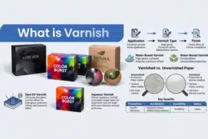
What is varnish coating even doing
It sits as a layer over the print. Could be glossy, could be flat and matte, sometimes a mix.
It’s not only there to look nice though. Boxes pass through a lot of hands before reaching anyone, trucks, shelves, sometimes get tossed around more than they should. The coating is what keeps it presentable through all that.
Sometimes it’s only applied to one part, just a logo maybe, instead of the whole box. Coating everything isn’t always necessary, the part you want noticed first is usually enough.
Why brands bother with this at all
A box is saying something before anyone even reads what’s written on it. Shine, texture, whatever finish was used, it’s already telling people something about quality before they’ve processed the brand name.
A premium feel on the outside builds a bit of quiet trust about what’s inside. Basically free marketing if you think about it that way, which is probably why finish decisions get more thought now instead of being some last minute add on.
Types of varnish
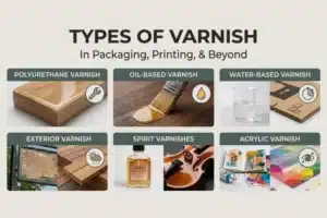
Gloss
The shiny kind. Catches light, pops a little when someone’s walking past a shelf.
Works well for logos and bold color areas, stuff that needs to grab attention fast. A lot of snack and drink brands lean toward gloss because the competition on shelves is brutal and you need something that stands out.
Doesn’t have to cover the whole box either. Spot gloss just on the logo can actually look better than coating everything.
Matte
The calmer one. No shine, just a smooth flat surface.
Feels expensive even on basic packaging, that’s why skincare and beauty brands use it a lot.
Also handles store lighting better. Gloss can glare under those fluorescent lights and the design kind of disappears, matte doesn’t have that problem.
Soft touch (some call it velvet, some say satin)
This is more about texture than appearance. Almost feels like fabric when you touch it.
Good fit for gifting and luxury products where opening the box is meant to feel like a small moment. Light colours usually work better here since it’s the texture doing the work, not the color.
UV varnish
Dries fast, that’s really the whole point of it. Cured under UV light right away instead of sitting around drying naturally.
Holds up better against scratches and fingerprints too. Brands doing big print runs usually go this way since it stays consistent across large batches and saves time.
How people actually decide
Comes down to a handful of normal things really.
Budget first. Some finishes need extra steps so they cost more, good to know your range before getting attached to something you can’t afford.
What’s inside the box matters too. A finish good for candles might not suit electronics or food packaging at all. Match it to the product rather than just whatever looks nice.
The vibe you want, bold and shiny versus calm and premium. Sort that out early, saves going back and forth later.
If the product is marketed as eco friendly, the packaging has to match that. Doesn’t make much sense putting a heavy chemical varnish on something labeled green.
A bit about the eco side
People pay attention to this more than they used to. Packaging isn’t really separate from the sustainability conversation anymore.
Where possible, go for water based or certified eco varnish. Worth asking the vendor to actually show proof rather than just trusting a claim on their site.
Full coverage isn’t always needed either. Spot application where it counts saves material and money, which works out for everyone.
Recycled paper stock works fine with most varnish types too, an easy change if that’s something your brand cares about.
Common mistakes
Going full gloss because a sample looked nice on a screen happens a lot. Screen and print don’t always match, what looks great in a mockup can look kind of cheap once it’s actually printed.
Skipping a physical sample before the full run is another one. Always worth getting a real sample first, saves a lot of regret later.
Not thinking about how rough the product gets handled is the third one. A delicate finish on something that gets tossed around in shipping won’t survive long.
Finding the right people for this
The finish is only as good as whoever’s actually applying it.
That’s where ZJ Packaging fits in. We work across gloss, matte, soft touch, UV, whatever actually suits your product and budget, and we run sample checks before full production so nothing surprises you later.
If you’re still not sure which finish fits your brand, that’s normal too. Happy to just talk it through and figure out what makes sense for what you’re putting in the box.



