
You’ve been working for weeks on your packaging design. The colors appear fabulous on your computer. The logo is sharp. The typography is a good match. Then the printed boxes come — and there’s something that doesn’t look right. The logo is a bit fuzzy. Fine text is unclear. The colour you have chosen appears unappealing on the box.
What Does DPI Actually Mean?
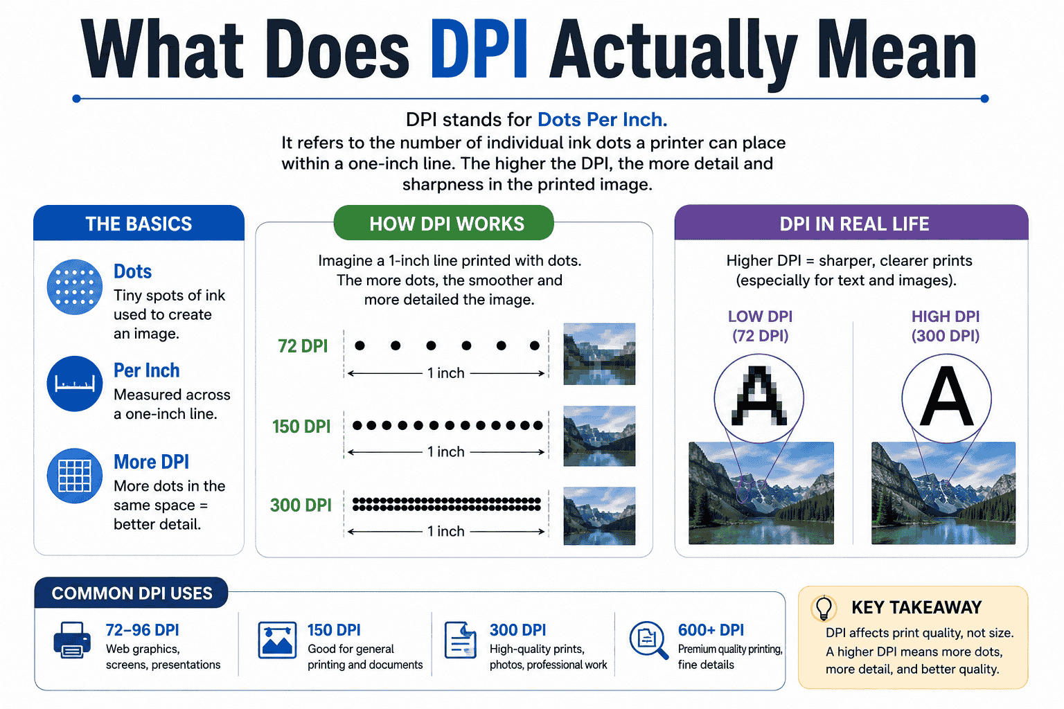
DPI is the acronym for Dots Per Inch. It is a measure of the resolution of the printing process, or the number of individual drops of ink that a printer deposits in an inch of printed surface.
Use your imagination – just as you would do when you look at a print through the magnifying glass. The image you would see is not a continuous image, but rather thousands of tiny ink dots that are compacted tightly. The higher the dots the more compact the picture will appear to the naked eye. The fewer dots, the rougher and softer and more pixelated the image will appear.
Here’s the deal with DPI in a nutshell.
A 300 DPI image has 300 dots per inch. A 72 DPI image has only 72 of. The difference between the two is huge – and that’s the reason packaging designers, printers and brand managers pay close attention to this number before anything is sent to press.
DPI vs. PPI: Are They the Same Thing?
Here’s where many people get stuck, so let’s clarify that.
Pixels Per Inch (PPI) is a measure of the resolution of the digital image (what appears on your screen). It is the number of pixels per inch of the display.
DPI (dots per inch) is a characterization of printed output — the number of individual ink dots the printer deposits on the paper, cardboard, film, etc. (substrate).
When you save a Photoshop or Illustrator file with a setting of ‘300 DPI’, you’re technically saving a file at 300 PPI. However, the printer will understand it as a resolution and convert it into real dots on your packaging media when it’s sent to the printer.
In regular speech, designers and printers often get the two terms DPI and PPI mixed up — and when it comes to printing packaging, the key takeaway is that your digital file is going to the press at the right resolution.
Why DPI Matters So Much for Packaging
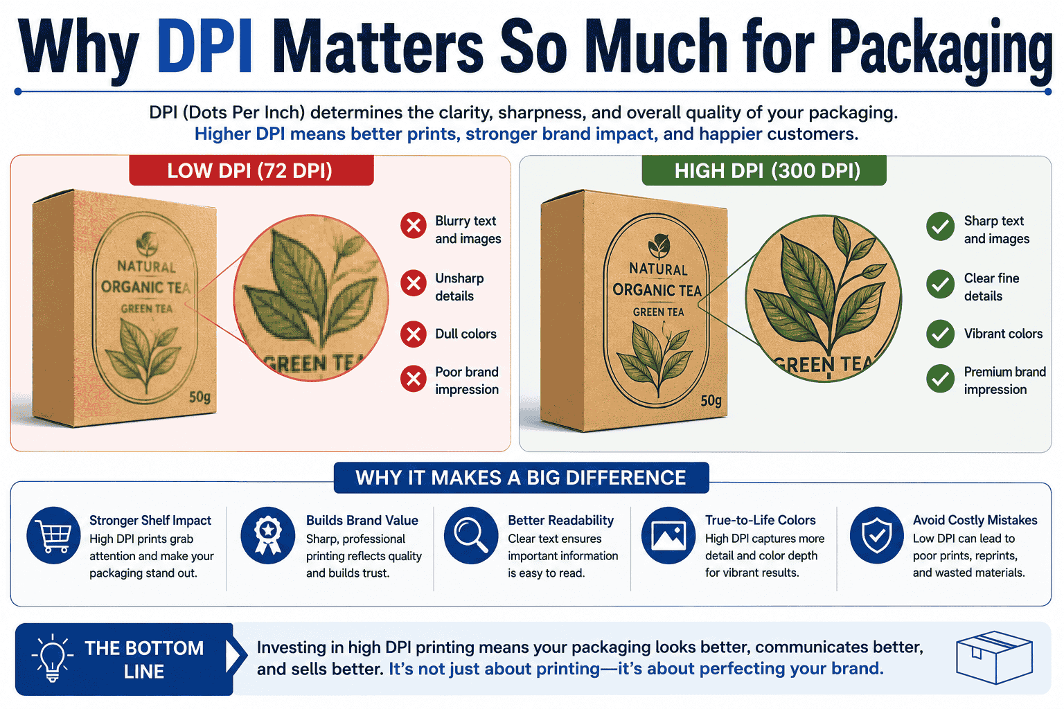
Packaging is not like a website or a social media post. On a screen, even lower-resolution images can look acceptable because the display fills in the gaps. Print doesn’t work that way. The printer can only work with the information you give it.
Here’s what’s at stake:
Brand Perception Your packaging is often the first physical touchpoint a customer has with your brand. A blurry logo or pixelated pattern sends an unintended message — that quality isn’t a priority. Customers notice, even if they can’t explain exactly why something looks “cheap.”
Fine Details: Ingredient lists, barcodes, certifications, legal text — all of these require sharp, readable print. If your DPI is too low, small text can become illegible. Barcodes can fail to scan. Certification logos can look smeared.
Color Accuracy, Resolution and color are linked. When a printer doesn’t have enough dot information, it can struggle to render subtle gradients, smooth transitions, and nuanced tones — leading to banding, uneven fills, or washed-out hues.
Consistency Across Print Runs If you’re printing thousands of boxes, you need every unit to look identical. Starting with the right DPI ensures your files are consistent and production-ready from the start.
How to Check and Set DPI in Your Design Files
While using Adobe Photoshop: Menu: Image → Image Size. Be sure to uncheck Resample, and examine the Resolution field. When printing, you want the maximum possible 300 (or more) ppi.
Working in Adobe Illustrator or InDesign: Vector artwork, or logos, type, and shapes will always print crisply, no matter what DPI setting you use. When there are raster images (photographs, textures, product shots) in the file, however, they need to be at least 300 DPI.
If you are using Canva or other online software: Be sure that your file is downloaded in the highest resolution, typically as a PDF or PNG. Be sure that the site allows exports at 300 DPI: some free sites do not. Use a professional packaging design application (where available), for professional packaging.
The Most Common DPI Mistakes in Packaging Design
These are common issues for even experienced designers. Be wary of:
Web images are typically 72 DPI and are saved at a low resolution, generally with small pixel dimensions, and are pulled from the internet. Enlarging them to fit a packaging layout will NOT increase the resolution; it simply extends the pixels. It leaves a fuzzy and blurry print. Use stock photography which is retrieved in a high resolution, or original photography, which is taken in a high resolution setting.
Enlarging a low-resolution image. A lot of designers get into this situation: they start with an image at 72 DPI, increase the DPI in Photoshop, and think the issue is solved! It isn’t. It is not effective to alter the DPI value without resampling, because the number of pixels will remain the same, and will only alter the way they are interpreted. The picture will remain poor even when you’re trying to print it. The more real pixels, the more real resolution.
Images are frequently “linked,” not embedded, due to forgotten linking. When the images are not linked in Illustrator or InDesign. You might not see the same DPI in your document as in the linked files. To ensure that each placed image is at the desired printing resolution, check its print resolution from the “Links” panel or from your printer’s preflight tool before printing.
Typically, screenshots are taken at 72-96 DPI, which is fine for presentations, but not for packaging. A product interface, app shot, or digital asset needs to be reproduced at the right resolution from the original source if necessary for packaging.
“Looks fine on screen” means “will print fine.” Your screen is a backlit display, which will allow you to see the lower resolution. A 150 DPI image will look crisp on a Retina screen. It will not present a sharp look on a print box. ALWAYS PROOFREAD YOUR FILES BEFORE YOU PRODUCE THE WHOLE RUN.
DPI and Different Printing Processes
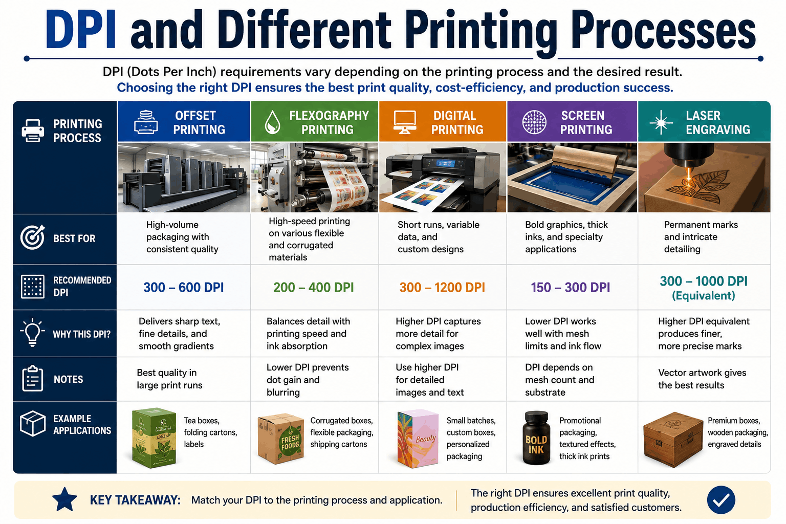
One thing many brands don’t realize is that different printing technologies have different DPI relationships. The number on your file and the number the press actually achieves aren’t always the same thing.
Offset Lithography — Used for high-volume folding cartons and labels. Commercial offset presses typically print at 150–200 LPI (lines per inch), which corresponds to roughly 300–400 DPI in your artwork file for optimal results.
Digital Printing — Increasingly common for short runs and custom packaging. Digital presses handle 300–600 DPI artwork well and often produce exceptional results with photographic content.
Flexographic Printing — Common for flexible packaging, corrugated boxes, and bags. Flexo has slightly lower resolution characteristics than offset, which is why 150–200 DPI can be acceptable for some applications.
Screen Printing — Used for specialty packaging and promotional items. Resolution is limited by mesh count; photographic detail is difficult to achieve.
Your packaging manufacturer can advise on the ideal DPI for their specific press. Don’t hesitate to ask — they want your job to come out looking great too.
Final Thoughts
Once you understand what it is, it is not difficult to get DPI right. It is not a magic number, it’s a number of information measures! The more dots your file can yield, the more your printer can do, the better it will look on the shelf, in customers’ hands, and in the marketplace.
But if there is one thing to take away from this article, it is this: always design at 300 DPI from the beginning using original high-resolution assets, and don’t assume that a file is print-ready simply because it looks good on screen.



