
Honestly, the soap itself is only half the story. Before anyone smells the lavender or the charcoal bar inside, they’ve already judged you by the box. That’s just how it works. People decide in about two seconds whether something feels cheap or expensive, and most of that decision has nothing to do with what’s inside.
So if your brand is still shipping soap in a plain cardboard sleeve — the kind that looks like every other cardboard sleeve — you’re probably losing sales you don’t even know about.
Here’s what’s actually working for soap brands right now, not the buzzword version, the real one.
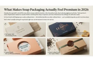
Pristine doesn’t mean “clean” anymore
A few years back, pristine packaging just meant white, tidy, unmarked. Nobody cares about that anymore. Now it means somebody clearly thought about this box — the crease lines, the paper weight, the font, all of it.
Why does this matter so much? Because when a customer picks up your box, that’s the moment they decide if the soap inside is worth the price. Not when they read your Instagram caption. Not when they see the ad. When they physically hold it.
And the boxes that get this right walk a strange line — protective enough to survive a delivery truck, but designed like someone actually gave a damn.
Minimalism got more interesting
A plain white box with small black text used to be “minimalist.” That’s outdated now. What’s replacing it is quieter but more expensive-feeling.
Take soft-touch matte lamination — instead of bouncing light back at you like a glossy box does, it absorbs it. The box just feels heavier and calmer in your hand, even if it’s not actually heavier at all. It’s a bit of a trick, but it works.
Then there’s blind embossing, which I honestly think is underused. No ink, no color — you just press the logo straight into the paper so it shows up as shadow and light. It’s quiet. Confident. The kind of detail that says “we didn’t need to shout.”
Sustainability, but the kind people actually believe
Everyone claims their packaging is eco-friendly this year. Customers have gotten cynical about it — rightly so, since a lot of it is just a green box with a leaf logo slapped on.
Seed-embedded paper is one of the few ideas that actually holds up. Once the soap’s gone, you plant the box, and it grows wildflowers or herbs. It’s a small thing, but it gives people a reason to keep the brand around after the purchase is done — and yes, they post it online without anyone asking them to.
Geometric die-cuts are also replacing plastic windows, which, let’s be honest, nobody liked anyway. Cut patterns straight into the box instead, and the soap’s texture shows through on its own.
And recycled kraft paper with soy ink — not flashy, not glossy, but it reads as honest. Sometimes plain is the whole point.
Turning the unboxing into something
This is the part brands underestimate. A box isn’t just a container — for a lot of customers, opening it is part of the product.
Slide-out drawer boxes, the kind with a ribbon pull, borrow straight from jewelry packaging. There’s something about pulling that ribbon slowly that makes the soap feel worth more, even before you’ve touched it.
Magnetic closures do something similar. That little click when it shuts — it’s such a small detail, but it tells your brain “this was made properly” before you’ve read a single word on the box.
The old apothecary look is back, and it’s not going anywhere soon
There’s a real wave of nostalgia for the old pharmacy look right now — heavy on typography, light on flashy printing.
Botanical engravings, the fine etched drawings of herbs or oils, printed on rough uncoated stock, do a lot of the heavy lifting here. They look handmade even when they’re printed on a machine.
Classic serif fonts help too. It’s a small choice, but it signals heritage and care in a way a trendy sans-serif font just can’t.
Before you order 5,000 boxes, a couple of things
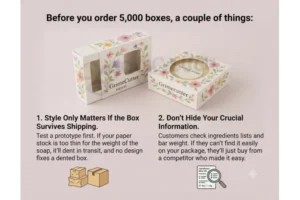
Style only matters if the box survives shipping.
Test a prototype first. If your paper stock is too thin for the weight of the soap, it’ll dent in transit, and no design fixes a dented box.
And don’t hide your ingredients list or the weight of the bar behind a fancy design. Customers check that stuff now. If they can’t find it easily, they’ll just buy from someone who made it easy.
So, which one’s right for you?
There’s no single correct answer here. Minimalist, eco-kraft, apothecary-style — pick whichever one actually matches what your brand is about, not whichever one looks trendiest this month. Because at the end of the day, you’re not really selling soap. You’re selling the two seconds before someone even opens the box.



